Explore ratio charts to uncover hidden asset performance trends and enhance your trading strategy with effective analysis methods.
Ratio charts are a simple yet powerful way to compare the performance of two assets. By dividing the price of one asset by another, these charts reveal trends and relationships that ordinary price charts might miss.
Why Use Ratio Charts?
- Spot Trends: See which asset is outperforming.
- Gauge Sentiment: Understand market shifts.
- Manage Risk: Balance portfolios using relative strength.
- Analyze Sectors: Compare companies or industries.
How to Use Ratio Charts
- Create a Chart: Divide one asset's price by another.
- Interpret Patterns: Look for trendline breaks, support/resistance, and moving averages.
- Enhance with Indicators: Add RSI, MACD, Bollinger Bands, or tap into LuxAlgo toolkits like Oscillator Matrix and Signals & Overlays for deeper insights.
Key Takeaways
- Ratio charts highlight relative performance, not absolute price movements.
- Combine them with other LuxAlgo tools like moving averages or sector screeners.
- Use across stocks, sectors, indices, and commodities for better trading decisions.
Quick Tip: A rising ratio means the first asset is outperforming the second. For example, a breakout in the HDFC/SBI ratio in 2011 signaled HDFC Bank's dominance, doubling the ratio in three years.
Ratio charts are an essential method for traders to make informed decisions. Ready to dive deeper? Let’s explore their creation, interpretation, and advanced applications.
Creating and Understanding Ratio Charts
How to Create a Ratio Chart
A ratio chart is built by dividing the price of one asset by another. Many platforms simplify this with built-in scripting. For instance, ThinkScript on the thinkorswim platform lets you create custom ratio charts easily.
Here’s a simple ThinkScript example to compare Apple and Microsoft stock prices:
input symbol1 = "AAPL";
input symbol2 = "MSFT";
plot ratio = close(symbol1) / close(symbol2);
This divides the closing prices of the two stocks. Key elements include:
| Component | Description | Purpose |
|---|---|---|
| Price Data | Closing prices of assets | Raw numbers for the ratio |
| Custom Inputs | User-defined parameters | Flexibility in choosing assets |
| Technical Indicators | Moving averages or trend lines | Extra market analysis |
Common Ratio Chart Types
- Stock-to-Stock Ratios: Compare individual stocks in the same industry to highlight relative strength.
- Sector Ratios: Analyze technology (XLK) vs. energy (XLE) to spot sector rotation.
- Index Ratios: Examine S&P 500 vs. Dow Jones to gauge market trends.
- Commodity Ratios: Gold-to-silver ratio to uncover precious metals opportunities.
Reading Ratio Charts
Chart Patterns and Signals
After creation, interpret patterns and signals. A rising ratio means the first asset is outperforming the second. For example, the TCS/Infosys ratio trended up from 2009–2020 but later broke a 10-year trendline, signaling a shift in relative strength.
| Pattern Type | Signal | Trading Implication |
|---|---|---|
| Trendline Break | Change in relative performance | Reevaluate positions |
| Channel Formation | Defined range | Trade within boundaries |
| Support/Resistance | Reversal points | Spot entries/exits |
| Moving Average Crossovers | Momentum shifts | Adjust timing |
Measuring Asset Strength
During March–July 2020, the Maruti/M&M ratio dropped, then bounced off trendline support—hinting at a reversal toward Maruti. To evaluate strength:
- Establish Context: Compare similar assets.
- Confirm Trends: Use absolute price charts alongside ratios.
- Monitor Key Levels: Identify support/resistance shifts.
Advanced Ratio Chart Methods
Adding Technical Indicators
Combine a Moving Average Ratio (MAR) with RSI, MACD, or Bollinger Bands to refine signals. Example:
| Combination | Primary Function | Use Case |
|---|---|---|
| MAR + RSI | Trend confirmation | Entry/exit timing |
| MAR + MACD | Divergence spotting | Potential reversals |
| MAR + Bollinger Bands | Volatility tracking | Range-bound plays |
Timeframe Analysis
| Level | Purpose | Example |
|---|---|---|
| Higher | Overall trend | Weekly charts |
| Intermediate | Actionable signals | Daily charts |
| Short-term | Entry/exit refinement | 60-minute charts |
Trading with Ratio Charts
Implementation Guide
-
Asset Selection:
- Choose related assets or sector ETFs.
- Display price data with LuxAlgo indicators for context.
-
Define Parameters:
Ratio Signal Action Risk Management Rising Long stronger asset Stop-loss below entry Falling Long weaker asset Profit at resistance Sideways No position Watch for breakout -
Integration:
- Moving averages
- Momentum indicators
- Volume analysis
- Multi-timeframe alignment
Tips & Common Mistakes
- Keep a detailed trade log.
- Factor in market context.
- Use multiple confirmations.
- Set clear risk parameters.
| Mistake | Impact | Solution |
|---|---|---|
| Ignoring context | Missed drivers | Assess broader trends |
| Poor risk management | Large losses | Use stop-loss levels |
| One indicator only | Missed trades | Combine tools |
| Late entries | Less favorable trades | Wait for confirmation |
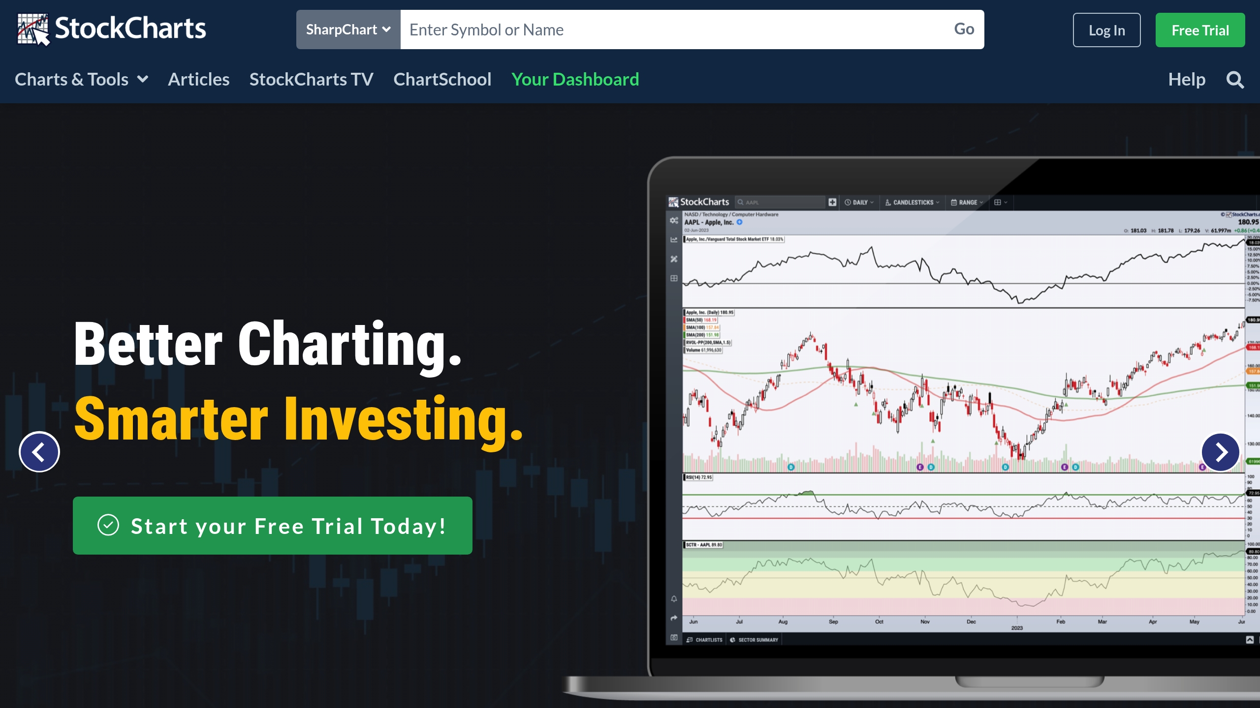
How To Create Ratio Charts Using Stockcharts

Ratio Charts in Practice
Trading Examples
- HDFC Bank vs. SBI: Mid-2011 breakout signaled a paired trade—long HDFC, short SBI—doubling the ratio in three years.
- TCS vs. Infosys: 2009–2020 uptrend broke a key trendline, shifting strength toward Infosys.
| Timeframe | Signal | Action | Outcome |
|---|---|---|---|
| Mid-2011 | Channel breakout | Long HDFC, Short SBI | +100% |
| 2009-2020 | Trendline break | Shift to Infosys | Improved performance |
| Mar–Jul 2020 | Support test | Watch for reversal | Potential shift |
Expert Trading Tips
- Blend with Analysis: Use absolute price charts and trendlines alongside ratios.
- Confirm with Indicators: Spot divergence, momentum, and volatility signals.
- Discipline Risk Management: Entry timing, position sizing, stop placement, and exit strategy.
Summary
Ratio charts offer a quantifiable, relative view of asset performance. By pairing them with other analysis tools and sound risk management, you’ll uncover opportunities that traditional charts might hide.


