Historical Liquidity Proximity Heatmap
By LuxAlgoMay 12, 2026

The Historical Liquidity Proximity Heatmap indicator helps traders identify the closest historical liquidity levels around current price using swing highs, swing lows, volume weighting, and a visual heatmap. By focusing on nearby pivot levels instead of every historical structure on the chart, this trading indicator creates a cleaner support and resistance map for spotting potential liquidity sweeps, breakout zones, reversal areas, and high-interest price levels.
How to Trade the Historical Liquidity Proximity Heatmap Indicator
This tool is designed to show where significant liquidity may be resting by tracking historical pivot highs and pivot lows, then sorting those levels based on how close they are to the current market price. Instead of forcing traders to manually scan old swing points, the indicator automatically highlights the most relevant nearby levels so traders can quickly understand where price may react next.
For many trading strategies, the closest liquidity levels are often the most important because they can act as short-term obstacles, targets, support zones, resistance zones, or sweep areas. When price moves toward these levels, traders can monitor whether the market rejects, consolidates, breaks out, or sweeps through them.
Identifying Liquidity Clusters
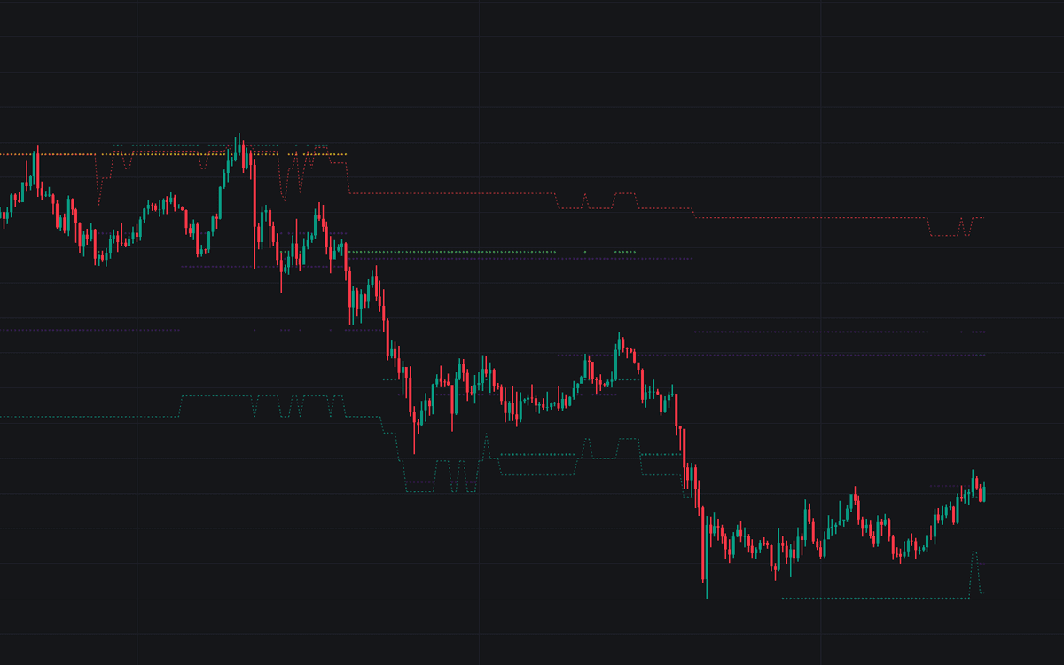
The indicator plots heatmap dots representing the nearest historical pivot highs above price and pivot lows below price. These dots help traders visualize where previous market structure exists in relation to the current price.
When multiple dots appear close together, it can suggest a stronger liquidity cluster. These clusters may represent areas where stop orders, breakout orders, or resting liquidity are concentrated. In practical trading, these zones can become important support and resistance areas, especially when price returns to them with momentum or high volume.
The color of each dot is based on the volume recorded when the pivot was formed:
- High-Contrast Colors: Represent pivot levels formed with higher volume, suggesting stronger market participation, greater institutional interest, or heavier liquidity.
- Low-Contrast Colors: Represent pivot levels formed with lower volume, which may indicate lighter liquidity or less significant historical price action.
By combining pivot structure with volume intensity, this trading indicator gives traders more context than a standard support and resistance tool.
Reading Level Tests and Liquidity Sweeps
Traders can use the Historical Liquidity Proximity Heatmap to monitor how price behaves as it approaches nearby swing levels. If price touches or approaches a heatmap dot and quickly rejects, that level may be acting as active support or resistance.
A liquidity sweep occurs when price moves through one or more nearby liquidity dots, clearing historical swing highs or swing lows before reversing or continuing. This can be useful for traders who follow Smart Money Concepts, price action trading, breakout trading, or mean reversion strategies.
For example, if price pushes above several nearby pivot-high dots and then quickly moves back below them, it may suggest a buy-side liquidity sweep. If price drops below several nearby pivot-low dots and then reclaims the area, it may suggest a sell-side liquidity sweep.
Breakouts and Volumetric Swing Averages
The indicator also includes two dashed Volume-Weighted Swing Average lines. These averages summarize the displayed liquidity points into clearer breakout reference levels.
- Volume-Weighted Highs: A dotted red line showing the average price of the nearest pivot highs, weighted by historical volume.
- Volume-Weighted Lows: A dotted green line showing the average price of the nearest pivot lows, weighted by historical volume.
A breakout above the Volume-Weighted Highs line can suggest that price has cleared the weighted supply area near the current market. A breakdown below the Volume-Weighted Lows line can suggest that price has cleared the weighted demand area nearby.
These volumetric averages can help traders simplify the heatmap into actionable breakout levels. When price crosses these lines with strong momentum or increased volatility, traders may use them as confirmation that nearby liquidity has been absorbed or cleared.
How the Historical Liquidity Proximity Heatmap Works
The script maintains a historical buffer of swing pivots. On every bar, it checks stored pivot highs and pivot lows, then separates them into levels above the current price and levels below the current price.
After filtering the pivots, the indicator sorts them by distance from current price. The closest P levels are selected and displayed on the chart. This keeps the heatmap focused on the most relevant support and resistance levels, even when price has moved far away from older structures.
This proximity-based approach makes the indicator useful for active traders who want a cleaner view of nearby liquidity rather than a chart crowded with every historical pivot.
The heatmap colors are based on perceptually uniform palettes such as Viridis, Inferno, Magma, Plasma, Cividis, and Turbo. These color themes are designed so changes in color intensity are easier to interpret visually, helping traders compare relative volume and liquidity weight more naturally.
Historical Liquidity Proximity Heatmap Settings
Pivot Detection Settings
- Pivot Left/Right Length: Controls the sensitivity of swing high and swing low detection. Larger values identify more significant structural swings, while smaller values detect more frequent short-term pivots.
- Historical Buffer Size: Controls how many historical pivot levels the script stores. A larger buffer allows the indicator to reference older market structure, while a smaller buffer keeps the analysis more recent.
Display and Heatmap Settings
- Number of Points (P): Sets the maximum number of closest liquidity levels to display and include in the Volumetric Swing Average calculation.
- Dot Transparency: Adjusts the visibility of the heatmap dots on the chart.
- Color Theme: Allows traders to choose between different heatmap palettes, including Viridis, Inferno, Magma, Plasma, Cividis, and Turbo, to represent volume intensity.
FAQ
What is the Historical Liquidity Proximity Heatmap indicator?
The Historical Liquidity Proximity Heatmap is a trading indicator that highlights nearby historical swing highs and swing lows using a volume-based heatmap. It helps traders identify potential support, resistance, liquidity clusters, breakout levels, and sweep zones.
How can traders use this indicator in a trading strategy?
Traders can use the indicator to find nearby liquidity levels, monitor price reactions around historical pivots, identify potential liquidity sweeps, and confirm breakouts using the Volume-Weighted Highs and Volume-Weighted Lows lines.
What do the heatmap colors mean?
The heatmap colors represent the volume recorded when each pivot level was formed. Higher-intensity colors suggest higher-volume pivots, while lower-intensity colors suggest lighter historical liquidity.
What are Volume-Weighted Swing Averages?
Volume-Weighted Swing Averages are dashed lines that calculate the average price of the nearest displayed pivot highs and lows, weighted by their historical volume. These lines can help traders identify clearer breakout or breakdown levels.
How do I access the Historical Liquidity Proximity Heatmap indicator?
You can get access on the LuxAlgo Library for charting platforms like TradingView, MetaTrader (MT4/MT5), and NinjaTrader for free.
Free indicator
Get free access to this indicator on the platforms below.
Unlock the entire LuxAlgo Library
Every indicator, every strategy, full charts, and complete access to Quant — our AI agent.