Concept
Wyckoff Accumulation Schematic
Wyckoff Accumulation Schematic, also known as PS, SC, AR, ST, is a Wyckoff concept. The Library holds 1 implementation — a working definition you can pull into Quant.
phases A–E
Top Wyckoff Accumulation Schematic indicator
The top custom implementation, built on the original standard Wyckoff Accumulation Schematic formula.
1 total
This Wyckoff Accumulation Schematic implementation is strategy-ready: open it in Quant, set your rules, and it backtests automatically.
What is the Wyckoff Accumulation Schematic?
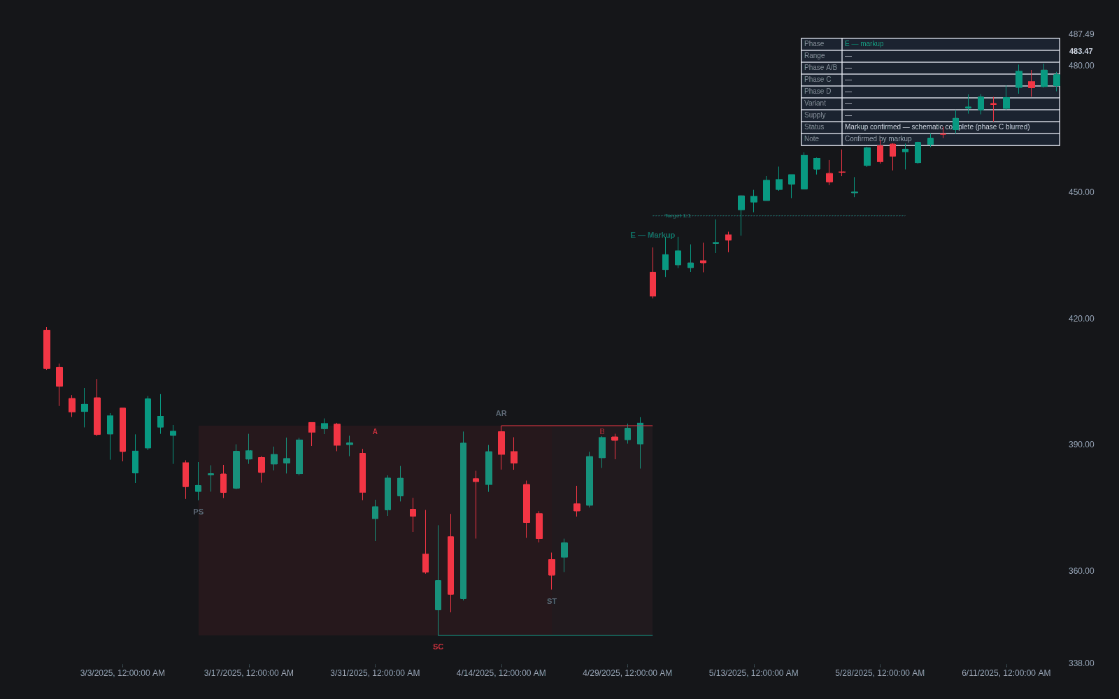
The Wyckoff Accumulation Schematic is the idealized map of how a downtrend ends and a new uptrend is prepared. Phase A stops the decline: preliminary support (PS), a selling climax (SC), an automatic rally (AR), and a secondary test (ST) together define a trading range. Phase B builds the cause as the range develops and larger interests accumulate. Phase C is the final test of supply, often a spring below support. Phase D shows strength: signs of strength (SOS) on expanding volume and last points of support (LPS) on quiet pullbacks, including the back-up that follows once price jumps the creek (breaks range resistance). Phase E is markup, the trend leaving the range.
The schematic descends from the Wyckoff Method, the body of work Richard D. Wyckoff built from tape reading and from studying the campaigns of large operators in the early twentieth century; his course was first published in 1931. The labeled diagrams traders use today were refined by his successors, and much of the folk vocabulary comes from Robert G. Evans, who taught the course after Wyckoff's death and coined analogies such as jumping the creek for the breakout through range resistance. The underlying premise is Wyckoff's composite operator: read the range as if a single well-financed interest were quietly absorbing supply in preparation for a markup.
Mechanically, the schematic expresses Wyckoff's law of cause and effect: the sideways range is the cause, and the extent of the subsequent trend is held to be proportional to it, traditionally estimated with point-and-figure counts across the range. Its diagnostic engine is effort vs result logic. Declines into support that shrink in volume, heavy volume that produces no downside progress (absorption), and rallies that begin to travel farther on similar effort are the fingerprints that separate accumulation from mere congestion.
Published Wyckoff materials show two variants: schematic #1 ends phase C with a spring, while schematic #2 bottoms with higher-low tests inside the range and no spring. The schematic is a sequence and a vocabulary, not a template price must obey: real ranges skip, repeat, and blur events, and labels like SC or LPS are provisional until markup confirms them. Its practical value is locating where in the story a market might be, then demanding the right behavior before acting on the label.
How to identify Wyckoff accumulation on a chart
Work left to right, labeling events only after the reaction that defines them is complete.
- 1Start from an established downtrend and find phase A: a wide, high-volume flush (the SC), the sharp rebound that follows (the AR), and a lower-volume retest (the ST). The SC low and AR high set the range boundaries.
- 2Track phase B between those boundaries: swings in both directions, with the constructive tell being declines that progressively shrink in volume and spread while rallies hold more of their ground.
- 3Watch for the phase C test: either a spring that undercuts support and recovers quickly on modest volume, or a higher-low test that never reaches it.
- 4Demand phase D confirmation: at least one sign of strength, a rally with expanding spread and volume that presses or breaks range resistance, followed by an LPS or back-up that holds above broken levels on quiet volume.
- 5Cross-check the whole range against the mirror scenario in the Wyckoff Distribution Schematic; if upthrusts keep failing at the highs while down-swings gain volume, the bullish labels do not apply.
How traders use it
- As a phase locator: label PS, SC, AR, and ST to establish the range boundaries, then track phase B behavior and wait for the phase C test before expecting resolution.
- As an entry framework: the classic long entries are the spring or test in phase C and the LPS or back-up in phase D after a sign of strength, with stops beneath the relevant low.
- As a discrimination tool: comparing volume on rallies versus reactions across the range helps separate accumulation from distribution, since mid-range the two can look nearly identical.
- For target estimation: traditional practice takes point-and-figure counts across the completed range to project how far markup might carry, treated as a rough objective rather than a promise.
- With wave measurement: Wyckoff Wave & Volume Studies quantify the rally-versus-reaction comparison, putting numbers on whether buying waves are starting to dominate.
- Across timeframes: the sequence appears fractally, so an intraday accumulation range can form the LPS of a larger structure, and reading both scales together sharpens timing.
Wyckoff accumulation vs. related Wyckoff concepts
Wyckoff Distribution Schematic: The mirror image: distribution maps how an uptrend is ended and markdown prepared, with a buying climax instead of a selling climax and a UTAD where accumulation has its spring. Mid-range the two can look nearly identical; resolution behavior separates them.
Wyckoff Method: The parent framework: the method supplies the laws (supply and demand, cause and effect, effort versus result) and the composite-operator premise, while the schematic applies them to one specific situation, the ending of a downtrend.
Wyckoff Wave & Volume Studies: The measuring instrument: wave studies compare volume and progress swing by swing, which is how the quality of secondary tests, springs, and signs of strength inside the schematic is actually graded.
Concept family
Wyckoff
17 concepts mapped · 17 in the Library
Wyckoff Accumulation Schematic FAQ
What are the phases of Wyckoff accumulation?
Phase A stops the downtrend with preliminary support, a selling climax, an automatic rally, and a secondary test. Phase B builds the cause while the range develops. Phase C delivers the final test of supply, often a spring. Phase D shows signs of strength and last points of support as price presses the top of the range. Phase E is markup. Real markets follow the sequence loosely, and labels are confirmed only in hindsight.
What is the difference between Wyckoff accumulation schematic 1 and 2?
Schematic #1 includes a spring: the phase C test undercuts range support before markup begins. Schematic #2 bottoms without one: phase C instead prints tests that hold at or inside the range lows, forming higher lows into the breakout. Both share the same phase logic and event vocabulary; the difference is only in how the final test of supply is expressed.
What is a spring in Wyckoff accumulation?
A spring is the phase C event where price briefly undercuts the range support established by the selling climax, finds little follow-through supply, and recovers back into the range. It works as a final test: if a break of support cannot attract sustained selling, supply is judged exhausted. Springs on light volume that recover quickly are the textbook version; heavy-volume undercuts need a successful low-volume retest before they earn the label.
How long does Wyckoff accumulation last?
There is no fixed duration. The framework's own logic ties effect to cause, so larger subsequent trends are associated with longer or wider ranges, and the sequence appears on every timeframe from intraday to monthly. The teaching materials treat phase B as open-ended; it lasts as long as the absorption takes.
How do you tell accumulation from distribution while the range is still forming?
Often you cannot with confidence, which the Wyckoff literature itself concedes. The differential evidence arrives late: phase C and D behavior such as a spring that holds versus an upthrust that fails, rallies gaining volume versus losing it, and which boundary finally breaks on expanding spread. Until then, labels are working hypotheses.
Did Richard Wyckoff draw the accumulation schematics himself?
Not in the form traders use now. Wyckoff's course taught the events and phases through real charts and tape studies; the tidy diagrams numbered #1 and #2 were formalized by later teachers of the course and popularized in modern Wyckoff texts. The vocabulary is faithful to the course, but the diagrams are teaching aids from his successors.
Does the Wyckoff accumulation schematic work on crypto and forex?
The logic is market-generic and Wyckoff analysis is widely applied to both. The caveat is volume: spot forex has no centralized volume, so practitioners substitute tick volume or currency-futures volume, and thin crypto pairs can print climactic-looking bars from a single order. Where volume data is weak, the volume-dependent events such as the selling climax and its tests carry less evidential weight.
Turn Wyckoff Accumulation Schematic into a trading strategy.
Take the implementation from this page into Quant, then build on it, backtest it on real data, and keep refining it with AI.