Liquidity Price Depth Chart
 By LuxAlgoNov 14, 2023
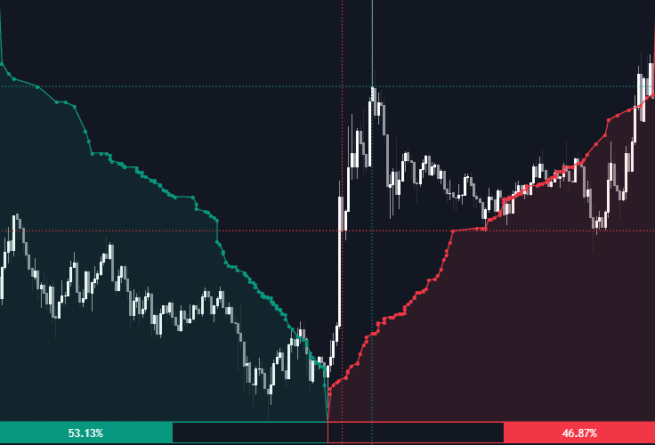
Liquidity Price Depth Chart re-imagines the DOM-style depth view using nothing but your chart's visible range: bullish prices are sorted into a dotted, line-connected curve on the left, bearish prices on the right, and the whole picture recalculates the moment the visible range changes. What you get is a depth silhouette of exactly the window you are studying — where liquidity stacked up, and for which side.
How to Trade the Liquidity Price Depth Chart?
- Line displacement: the further a stretch of the curve pushes along the x-axis, the more volume those prices carried — pronounced displacement flags zones of interest and possible larger moves ahead.
- Dotted horizontal lines: mark the highest-volume bullish and bearish prices in the range, usable as support and resistance references.
- Shape changes: a "V"-shaped profile flattening into rectangles signals liquidity clusters — densely packed prices where positions accumulate and volatility can turn elevated or non-stationary.
- Voids: reading the dots without their connecting lines reveals empty pockets that can play a significant role in later price action.
- Sentiment %: a percentage at the base of each side reports whether bullish or bearish activity dominates the visible range.
Liquidity Price Depth Chart Settings
- Bullish Price Highest Volume Location: marks where the maximum-volume bullish price sits, across both the depth curve and the price axis.
- Bearish Price Highest Volume Location: the same marker for the bearish side.
- Bullish Volume Percentage / Bearish Volume Percentage: display each side's share of volume directly on the chart.
- Volume % Box Padding: adjusts the width of the percentage boxes relative to the visible range.
Frequently Asked Questions
Is this an actual order book?
No — it is built from the bullish and bearish prices in your chart's visible range, not from exchange depth feeds. Think of it as a book-shaped lens on traded activity: the silhouette of a depth chart, reconstructed from price and volume.
How does it relate to Liquidity Heatmap LTF?
Both approximate liquidity from chart data, from opposite directions. Liquidity Heatmap LTF highlights heavy lower-timeframe candle bodies in place on the chart, while the depth chart re-sorts the entire visible range into one bullish/bearish curve.
How can I access the Liquidity Price Depth Chart?
Free access is available through the LuxAlgo Library. The indicator also works inside Quant, LuxAlgo's AI, right from this page.
Free indicator
Get free access to this indicator on the platforms below.

The Library is free. Quant makes it yours.
Pull any concept or indicator into Quant: rebuild it, retune it, or turn it into a backtested strategy of your own.