Martin Ratio
 By LuxAlgoJun 11, 2026
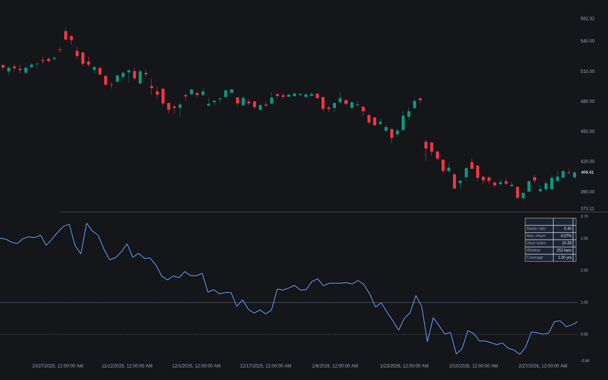
Martin Ratio scores growth per unit of drawdown pain, bar by bar. The charted series is treated as an equity curve; over the selected window the build computes the annualized return and the Ulcer Index (percentage drawdowns from the peak, root-mean-squared) and plots their quotient, the Martin ratio, around a zero line. A comparison symbol can be scored over exactly the same bars, so two track records are ranked while measured identically, and the dashboard keeps the components under the headline number.
How to Trade the Martin Ratio?
- Above zero: return beats the risk-free hurdle per unit of sustained drawdown; below zero the record is underwater on a drawdown-adjusted basis - both crossings carry alerts.
- Reference Level crosses: the dashed level supports threshold alerts both ways, though no absolute bar is universal.
- Ranking flips: with the comparison enabled, alerts fire when the chart symbol's ratio crosses the comparison's - the head-to-head verdict changing hands.
- Duration counts: squared drawdowns accumulate across every bar below the peak, so a long shallow underwater stretch scores worse than a brief dip of equal depth.
Martin Ratio Settings
- Source (default close): the equity-curve series.
- Window Mode (default Trailing window): rolling, or Entire history for the full loaded record.
- Trailing Window (Bars) (default 252): about one trading year of daily bars.
- Risk-Free Rate (%) (default 0): subtracted before dividing; many implementations omit it.
- Comparison Symbol (default off, SP:SPX): a second series scored on the same bars.
- Reference Level (default 1.0): the dashed threshold used by the level alerts.
- Show Dashboard (on, Top Right, Small); style: Gradient Fill (on) and Show Reference Level (on).
Frequently Asked Questions
Why use the Martin ratio instead of the Sharpe ratio?
Sharpe penalizes upside volatility along with downside; Martin's denominator registers only stretches spent under the high-water mark - closer to how risk is experienced. The trade-off is comparability: Sharpe's convention is standardized, while Martin readings depend on sampling frequency and window.
What does the denominator measure exactly?
The Ulcer Index: percentage drawdowns from the running peak, root-mean-squared, so it grows with both depth and time spent under the high; the dashboard reports it alongside the annualized return.
What counts as a good reading?
There is no universal bar - readings scale with the sampling convention, so a daily and a weekly reading are not comparable. Rank candidates scored the same way over the same stretch; the comparison mode exists for that.

The Library is free. Quant makes it yours.
Pull any concept or indicator into Quant: rebuild it, retune it, or turn it into a backtested strategy of your own.