Maximum-entropy Spectrum
 By LuxAlgoJun 14, 2026
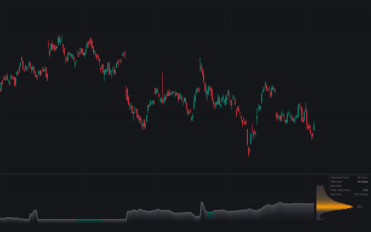

Maximum-entropy Spectrum measures which cycle currently dominates a market, and whether the reading deserves trust. Each bar the build high-passes the source, fits an autoregressive model with Burg's recursion, and evaluates its power spectrum across a period grid: the maximum-entropy spectrum, prized for sharp peaks on short windows. The smoothed dominant period plots as a line in bars, the spectrum as a heat profile beside the last bar.
How to Trade the Maximum-entropy Spectrum?
- Sharp rhythm: peak power at or above the Sharpness Threshold times the spectral average means one rhythm dominates; below it the dashboard reads flat or drifting and the line deserves less weight.
- Cycle shifts: a jump in the smoothed dominant period beyond the shift threshold fires its own alert.
- Half cycle: the optional half-period plot is the traditional choice when setting oscillator lengths from a measured cycle.
Maximum-entropy Spectrum Settings
- Source (default close) with Conditioning (default First Difference) and Detrend Length (default 48): high-pass preparation so trend cannot pose as a very long cycle.
- Sample Window (default 64): shorter tracks drifting cycles faster, longer stabilizes the spectrum.
- AR Order (default 12): too low blurs neighboring peaks, too high can split a real cycle; capped below half the window.
- Minimum Period (default 8) and Maximum Period (default 48): the evaluated grid.
- Cycle Smoothing (default 3): median-smooths the readouts.
- Sharpness Threshold (default 4.0) and Cycle Shift Threshold (default 5.0): the alert levels.
- Calculation Bars (default 2000), Show Spectrum Profile (on) with Profile Width (default 30), Show Half Cycle (off), plus dashboard toggles.
Frequently Asked Questions

Original indicatorBuilt in-house by LuxAlgo
The Library is free. Quant makes it yours.
Pull any concept or indicator into Quant: rebuild it, retune it, or turn it into a backtested strategy of your own.