January Effect
 By LuxAlgoMay 13, 2026
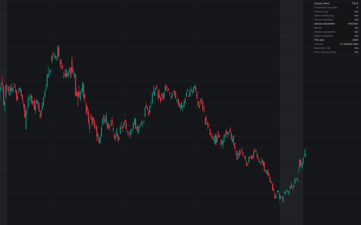

January Effect measures the January seasonal on the actual chart instead of asserting it, bringing the January effect into the library as its first dedicated study. A dashboard reports three sections from completed months: the effect itself (average January versus the other months, their difference the January premium), the January barometer (hit rate against an always-up baseline), and the current year's status. January windows shade by their running direction, and each completed January is labeled with its return and barometer outcome.
How to Trade the January Effect?
- January premium row: the average January return minus the average other-month return on this symbol. Positive means January has actually been the stronger month in the sample shown.
- Barometer call: January's direction calls the February-December window by default; only the edge over the always-up baseline is information. The dashboard prints both.
- Relative mode: run a small-cap index over a large-cap benchmark to study the size spread where the anomaly was originally documented.
- Calendar alerts: January opening, closing higher or lower, and the completed year grading the barometer call as hit or missed.
January Effect Settings
- Measure Relative To Benchmark (default disabled) with a benchmark symbol (default SP:SPX): study the chart symbol divided by the benchmark instead of raw price.
- Barometer Target (default Rest of year (Feb-Dec)): the Full year option matches the almanac phrasing but contains January itself, which flatters the hit rate.
- Sample Window (Years) (default 0): 0 samples every completed year on the chart; a positive value grades only the most recent years.
- Highlight January and January Return Labels (default enabled).
- Dashboard (default enabled) with position (default Top Right) and Dashboard Size (default Small).
Frequently Asked Questions

Original indicatorBuilt in-house by LuxAlgo
The Library is free. Quant makes it yours.
Pull any concept or indicator into Quant: rebuild it, retune it, or turn it into a backtested strategy of your own.