Relative Strength Scatter Plot
 By LuxAlgoFeb 6, 2024
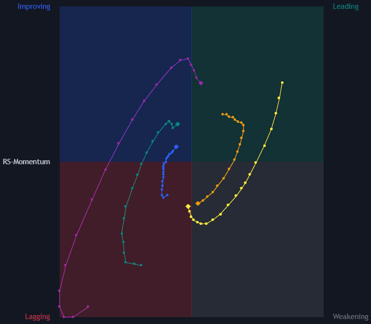
Relative Strength Scatter Plot places user-selected symbols on a four-quadrant graph of comparative relative strength against momentum, both measured versus a benchmark of your choice. Inspired by relative rotation graphs, it shows at a glance which markets lead, which are fading, and which are quietly building strength.
How to Trade the Relative Strength Scatter Plot?
- Green quadrant: leading the benchmark, strong relative strength ratio with positive momentum.
- Yellow quadrant: still ahead on strength but momentum is decaying, leadership at risk.
- Blue quadrant: lagging in strength while momentum improves, candidates rotating toward leadership.
- Red quadrant: lagging on both counts, the weakest corner of the graph.
- Trails: each symbol drags a configurable history behind it, so you watch its rotation through the quadrants rather than a single snapshot.
The RS-Ratio starts from the symbol's strength relative to the benchmark, smoothed with a linearly weighted moving average, normalized against a second WMA, and scaled by 100. RS-Momentum is derived from the ratio between the RS-Ratio and its own WMA, again scaled by 100: position on the X-axis, its momentum on the Y-axis.
Relative Strength Scatter Plot Settings
- Calculation Window: the lookback used to compute the RS-Ratio and RS-Momentum metrics.
- Symbols: the tickers to plot, each line with its own visibility and color controls.
- Benchmark: the reference symbol, typically an index, that every computation compares against.
- Trail Length: how many historical data points each symbol displays.
- Resolution: the horizontal breadth of the graph.
Frequently Asked Questions
Free indicator
Get free access to this indicator on the platforms below.

The Library is free. Quant makes it yours.
Pull any concept or indicator into Quant: rebuild it, retune it, or turn it into a backtested strategy of your own.