Concept
Relative Rotation Graphs
Relative Rotation Graphs are Breadth, Sentiment & External Data concepts. The Library holds 1 implementation, a working definition you can pull into Quant.
JdK RS-Ratio / RS-Momentum
Top Relative Rotation Graphs indicator
The top custom implementation, built on the original standard Relative Rotation Graphs formula.
1 total
From studying Relative Rotation Graphs to trading it: take the implementation below into Quant and backtest it instantly.
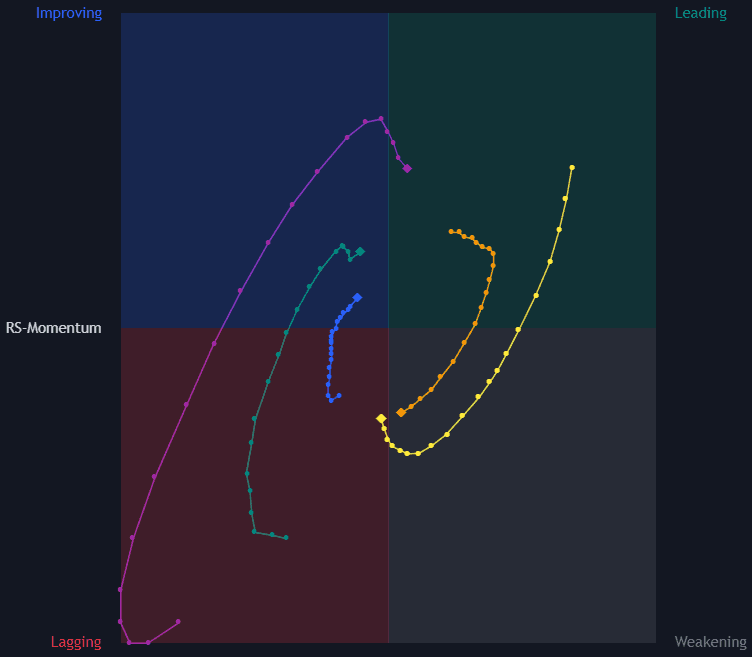
What are Relative Rotation Graphs?
A Relative Rotation Graph (RRG) is a two-axis scatter view of relative strength, created by Julius de Kempenaer. Each symbol in a watchlist is plotted against one benchmark: the horizontal axis is the JdK RS-Ratio, a normalized measure of the symbol's relative strength trend versus the benchmark, and the vertical axis is the JdK RS-Momentum, the rate of change of that ratio. Both are scaled around 100, so every symbol lands in one of four quadrants: leading (strong and strengthening), weakening, lagging, and improving.
De Kempenaer, a Dutch sell-side analyst, developed the display in the 2000s out of a practical frustration: institutional clients wanted one picture of many relative trends at once, not a stack of ratio charts. The design reached wide audiences when major platforms adopted it in the 2010s, and the JdK axis names preserve its authorship. The normalization is the design's core trick, since scaling every ratio's trend and momentum around 100 makes utilities and semiconductors legible on the same picture.
Because relative-strength ratios tend to oscillate around their own trend, symbols often travel clockwise through the quadrants over time, from improving into leading, then weakening, then lagging. Trails behind each point show the recent path. The rotation is a tendency, not a rule: names can stall, reverse, or cut straight across the chart. And the whole display is relative, so a symbol in the leading quadrant of a falling market is only falling less than the benchmark.
Two configuration choices quietly control everything shown. The benchmark defines the question (sectors against the index, countries against a world index, coins against bitcoin), and a symbol's quadrant can change entirely when the yardstick changes. The timeframe sets the rotation's clock, with weekly RRGs turning over weeks-to-months for position work and daily RRGs spinning faster for tactical rotation, so quoting a quadrant without its benchmark and timeframe says almost nothing.
How to read a Relative Rotation Graph
An RRG compresses a whole watchlist's performance against one benchmark into a single rotating picture. Reading it comes down to position, heading, and speed.
- 1Locate each symbol's quadrant. Right of 100 means its relative-strength trend is up (leading or weakening); left means it is down (lagging or improving). Above 100 means that trend is currently gaining momentum; below means it is losing momentum.
- 2Read the trail. The tail shows where the symbol came from and how fast it is moving: long, straight tails indicate a persistent relative move, while short or curling tails indicate hesitation or a turn in progress.
- 3Weight heading over location. A name in the lagging quadrant heading northeast is improving in practice, while a leading name hooking downward may be rolling over. Direction of travel usually says more than the box the dot sits in.
- 4Check the benchmark and timeframe. Rotations on weekly data unfold over months and on daily data over weeks, and the same symbol can occupy different quadrants on each. Everything shown is relative to the chosen benchmark, not absolute performance.
- 5Read the whole cloud as breadth: a universe fanned wide across quadrants marks a rotational, stock-picker's tape, while a tight ball around the benchmark marks low dispersion where selection matters less.
How traders use it
- For rotation scans: relative-strength followers concentrate longs in symbols moving through improving into leading against the benchmark and reduce or avoid names sinking through weakening into lagging, an approach shared with sector rotation models.
- As a portfolio lens: plotting current holdings shows at a glance which positions still earn their place on relative strength and which are quietly decaying, sometimes before absolute price damage appears.
- Paired with absolute price work: because RRG position says nothing about the direction of price itself, entries and exits are usually taken from standard chart analysis, with the RRG acting as the selection filter.
- Across asset classes: plotting bonds, commodities, currencies, and equities against one neutral benchmark turns the RRG into an intermarket dashboard, the rotation view of money moving between classes.
- In FX and crypto: currency pairs against a strength benchmark serve as a rotation-style currency strength read, and altcoins plotted against bitcoin show which names lead or lag the market's own base asset.
RRG vs other relative-strength views
Relative Strength Comparative: The comparative RS line is one symbol against one benchmark over time, rich in detail and limited to one story per pane. The RRG normalizes and overlays a whole universe of such lines, trading each story's depth for the crowd's geometry.
Ratio Charts: A ratio chart is the raw material: one dividend series, readable with ordinary chart tools. The RRG derives trend and momentum from many ratios and standardizes both, which adds comparability and hides the levels and structure a ratio chart preserves.
% Stocks Above 20/50/200-day MA: Diffusion gauges compress a universe into one participation number against each member's own history. The RRG keeps every member visible and measures them against a common benchmark instead, breadth as a picture rather than a percentage.
Concept family
Breadth, Sentiment & External Data
63 concepts mapped · 63 in the Library
Relative Rotation Graphs FAQ
Turn Relative Rotation Graphs into a trading strategy.
Take the implementation from this page into Quant, then build on it, backtest it on real data, and keep refining it in conversation.