Relative Crypto Dominance Polar Chart
 By LuxAlgoMar 26, 2025
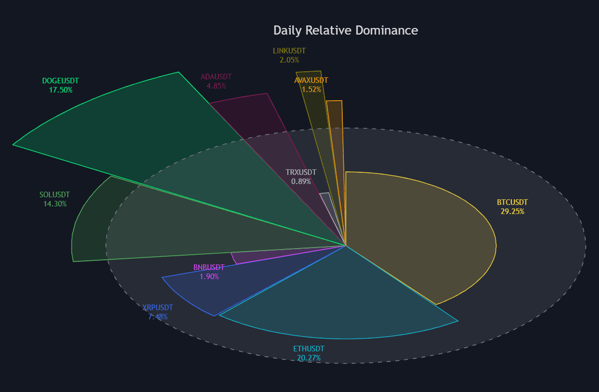
Relative Crypto Dominance Polar Chart condenses the relative strength of up to ten cryptocurrencies into a single polar area chart, blending traded dollar volume with volatility to estimate each coin's dominance. Every slice maps volatility to its radius and dollar volume to its arc length, so the larger the area, the more that ticker currently dominates the field.
How to Trade the Relative Crypto Dominance Polar Chart?
- Larger area: greater relative dominance for that ticker over the selected period.
- Long radius, narrow arc: a volatile coin without matching dollar volume (plenty of movement, thinner participation).
- Wide arc, short radius: heavy turnover with muted volatility, dominance built on participation rather than swings.
- Sorted layout: order the areas by volatility, ascending or descending, to turn the wheel into a ranked comparison.
The default basket holds the ten largest cryptocurrencies by market cap, though any tickers can be substituted. Period selection runs from hourly to yearly, and auto mode picks it from the chart's timeframe: hourly on the fastest intraday charts, scaling up to yearly on high-timeframe views.
Relative Crypto Dominance Polar Chart Settings
- Period: Hourly, Daily, Weekly, Monthly, or Yearly, with an Auto toggle that matches the period to the chart.
- Tickers: enable or disable each slot and pick per-ticker colors.
- Graph Order: the sort applied to the display areas.
- Graph Size: the percentage of available width the wheel occupies.
- Labels Size, Show Percent, Show Title, Curved Lines, Show Mean: label sizing, dominance percentages, the title, the petal-style curved rendering, and the volatility-average display.
Frequently Asked Questions
Free indicator
Get free access to this indicator on the platforms below.

The Library is free. Quant makes it yours.
Pull any concept or indicator into Quant: rebuild it, retune it, or turn it into a backtested strategy of your own.