Concept
Ratio Charts
Ratio Charts are Breadth, Sentiment & External Data concepts. The Library holds 2 implementations, each one a working definition you can pull into Quant.
Top Ratio Charts indicators
The top custom implementations, built on the original standard Ratio Charts formula.
2 total
From studying Ratio Charts to trading it: take any implementation below into Quant and backtest it instantly.
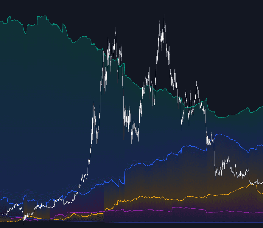
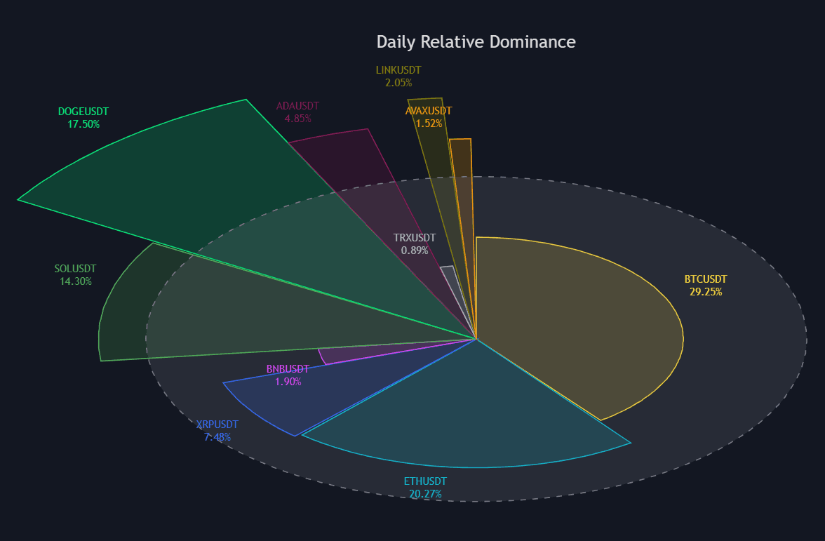
What are Ratio Charts?
A ratio chart plots one instrument's price divided by another's, bar by bar, so the line rises when the numerator outperforms and falls when it underperforms. Dividing strips out the direction both legs share and leaves pure relative performance, which is why ratio charts are the working surface of relative strength comparative analysis: sector versus index, stock versus sector, Bitcoin dominance, stablecoin dominance, copper versus gold, stocks versus bonds.
Standard technical tools apply to the ratio series itself: practitioners draw trendlines on it, run moving averages over it, and trade its breakouts. The essential caveat is that a ratio says nothing about absolute direction. It rises just as readily when both legs fall and the numerator falls less. Construction details also matter, since currency, dividends, and index methodology can each tilt the line.
The format's pedigree runs through both classic and modern practice. Relative strength charting against a benchmark has been a staple of equity analysis for decades, and cross-asset ratio work sits at the heart of the intermarket tradition John Murphy popularized: copper against gold as a growth read, stocks against bonds as a risk-appetite read, and the centuries-old gold/silver ratio in metals. Breadth-minded analysts chart an equal-weight index against its cap-weighted sibling to see whether the average stock confirms the headline index, a question also asked by advance/decline internals and the share of stocks above their moving averages.
Crypto adopted the format wholesale. Bitcoin dominance and stablecoin dominance are ratio charts of market capitalizations rather than prices, ETH/BTC is the default relative-value pair, and basket-versus-benchmark ratios feed the rotation logic inside crypto cycle models. Dominance ratios carry their own footnote: the denominator's composition shifts as tokens list and die and as stablecoins grow, so long-history comparisons are softer than they look, and traders often cross-check a dominance read against exchange and stablecoin flows before leaning on it.
How to set up and read a ratio chart
Most platforms build one straight from the symbol box; the craft is in choosing the legs and reading the result.
- 1Type the two symbols as a division expression in the symbol field, for example AAPL/SPY or XAUUSD/XAGUSD; most charting platforms, TradingView included, accept arithmetic between symbols.
- 2Match the legs: keep both in the same currency, and for long equity histories prefer total-return versions or accept that dividends tilt the line.
- 3Read slope and regime first: a rising line means the numerator is winning, while a flat, choppy line means no persistent leader, in which case relative bets have no tailwind.
- 4Apply the normal toolkit to the ratio itself: a long moving average for the regime, trendlines on the swings, momentum for divergence checks.
- 5Before acting, open both absolute charts side by side so you know whether a rising ratio means genuine strength or merely a shallower decline.
How it's calculated
One instrument's price divided by another's, plotted as a single series that tracks relative performance instead of absolute direction.
A rising ratio means A is outperforming B even if both are falling; it says nothing about absolute direction.
Use split and dividend adjusted prices in a common currency, otherwise the ratio drifts for non-market reasons.
Also called relative strength comparison, unrelated to Wilder's RSI.
How traders use it
- As rotation input: ranking sectors or assets by the trend of their ratio against a common benchmark drives overweight and underweight decisions; sector rotation models formalize the logic, and relative rotation graphs compress many of these relative lines into a single four-quadrant view.
- As crypto regime context: Bitcoin dominance and stablecoin dominance are ratio charts of market capitalizations, and a rising stablecoin share is commonly read as de-risking within the asset class.
- As a pairs tool: extremes and breakouts in the ratio between two related instruments generate long/short candidates, the discretionary cousin of a statistical pairs-trading stack.
- As a breadth check: the equal-weight versus cap-weight ratio and similar internal comparisons reveal whether leadership is broad or concentrated, context that changes how much an index-level breakout deserves trust.
- As macro risk gauges: stocks versus bonds, high-beta versus defensive sectors, and copper versus gold frame risk appetite from relative prices, a complement to option-derived fear measures such as the VIX.
Ratio Charts vs related concepts
Relative Strength Comparative: RS comparative is the benchmark-specific application: your symbol divided by an index. Ratio charts are the general construction, usable between any two instruments for any relative question.
Intermarket Analysis: The discipline that interprets bonds, stocks, commodities, and currencies as one connected system. Ratio charts are among its primary instruments; intermarket analysis supplies the economic reasoning about which ratios matter and why.
Currency Strength Meter: Every currency pair is already a ratio, and a strength meter aggregates dozens of them into one score per currency. A ratio chart shows a single relationship in full detail; the meter trades that detail for a ranked overview.
Concept family
Breadth, Sentiment & External Data
63 concepts mapped · 63 in the Library
Ratio Charts FAQ
Turn Ratio Charts into a trading strategy.
Take any implementation from this page into Quant, then build on it, backtest it on real data, and keep refining it in conversation.