Vela 0.10.0: A Standalone UI Kit and Themes Beyond Dark and Light
Vela 0.10.0 turns the UI kit that surrounds the chart into a package of its own, @luxalgo/vela-ui, and gives it a theming system that goes well past dark and light. This release of the open-source core of Vela by LuxAlgo is for developers who build trading interfaces around the chart, and for the coding agents they work with: the package now ships the skills, docs and reference an agent needs, matched to the installed version.
The UI kit is its own package
@luxalgo/vela-ui holds every component of the kit, its design tokens and its icons, with one import path per component. A page or a plugin can use the components without the chart and bundle only the ones it imports. Vela depends on the kit, and @luxalgo/vela/ui keeps exporting what it did, with renamed components under their old names until the next release.
The kit grows in this release. createContextMenu opens the dropdown menu's list on a right-click, a long press on a touch screen, or the keyboard's context-menu key, and items can be a function of the opening event so the rows depend on the spot. The chart, status line, legend and object tree menus now use it.
import { createContextMenu } from '@luxalgo/vela-ui/context-menu'

const menu = createContextMenu({
  target: panel,
  items: (event) => rowsFor(event),
  onSelect: handleSelect,
  longPress: false, // where a long press already means something
})
There are also data components: a sortable DataTable with a sticky header, Stat figures toned as a gain or a loss, Kbd, EmptyState, HoverCard, Sparkline, Donut, and three SVG charts with hover readouts, BarChart, LineChart and ScatterChart. Their colors come from the theme, including the new profit and loss tokens, which default to the candles' up and down colors. Buttons gain up and down variants for buy and sell. A new switch and an input group arrive, and several components take shadcn's names and props.
A command line manages the kit in a project:
npx @luxalgo/vela-ui add select           # direct dependency, prints the import
npx @luxalgo/vela-ui add button --source  # copy the source into your project
npx @luxalgo/vela-ui check                # duplicate copies, stale versions, theme mistakes
diff shows what changed upstream since a component was copied.
Themes beyond dark and light
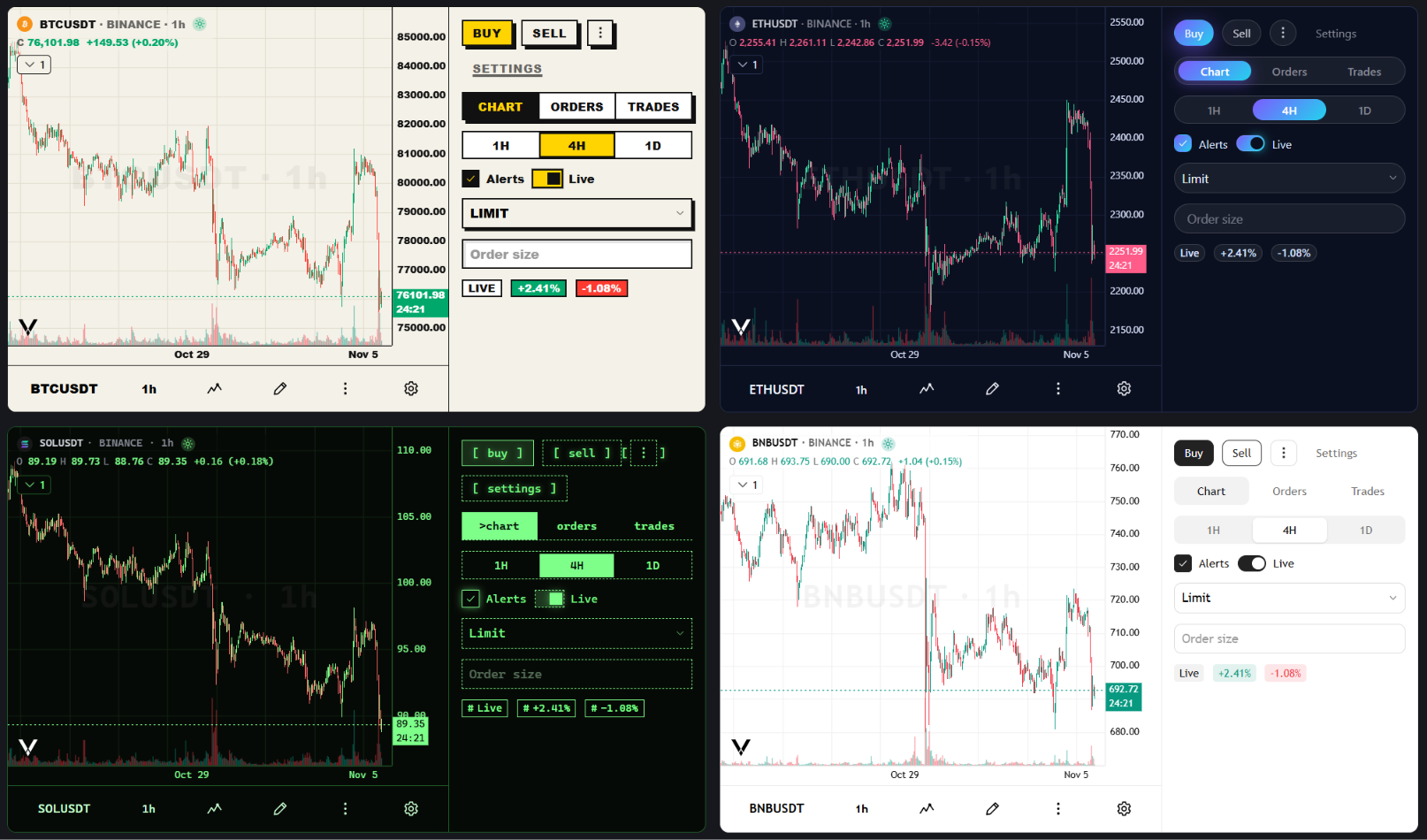
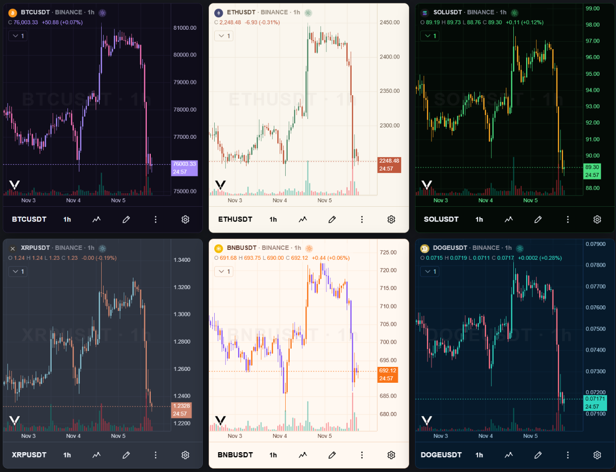
createTheme builds a whole theme from a few choices: a brand color with its readable ink derived, a radius scale, a font, any token by name, and the settings each component declares, checked by the typecheck. It can also build a theme from colors alone, reading light or dark from the background. Pass the result as theme or to setTheme, and offer it next to Dark and Light in the chart settings with registerTheme.
A component's css in the theme restyles its parts completely, written with the css tag, now exported from @luxalgo/vela/ui with the typed tokens t. It applies after every other layer of the kit, with & for the part's variants and states. The gallery's "shadcn look" rebuilds shadcn's buttons and tabs this way, from a theme alone.
import { css } from '@luxalgo/vela/ui'

const theme = createTheme({
  colors: { up: '#22c55e', down: '#ef4444' },
  components: {
    button: {
      radius: '2px',
      css: { root: css`text-transform: uppercase;` },
    },
  },
})

checkTheme(theme) // unknown tokens, components, parts, low-contrast text
setTheme(theme)
checkTheme lists what a theme gets wrong, and createTheme warns about each issue, so a misspelled name in a theme loaded from JSON is reported rather than ignored. CSS not written with the css tag, such as a theme loaded from a saved file, is left out unless the host passes { allowCss: true }. Theme tokens are now a stylesheet rule in the vela.theme cascade layer, so a page's own CSS overrides any token without !important, and the kit's styles sit in the vela.ui layer with a data-slot on every part.
A theme's candle colors now reach the candles. upColor and downColor (colors.up and colors.down in createTheme) used to color only the interface; they are now the candles' defaults, and a theme switch moves candles, wicks, borders and bars to the new theme's colors. Colors set with the chart's own options or in its settings stay.
Built for coding agents
The package carries what a coding agent needs, matching the installed version: six agent skills in skills/ (building charts, data providers, indicators and scripting engines, drawing tools, extending charts with plugins, upgrading from 0.9), the docs, the changelog and an llms.txt index.
npx skills experimental_sync    # link the skills into a project, the UI kit's three included
npx skills add LuxAlgo/Vela     # install them from the repository
@luxalgo/vela-ui ships its own reference too: manifest.json describes every component's import, props, variants, parts, settings, tokens and an example, and theme.schema.json is the JSON Schema of a theme file. All of it is generated from the source, so it cannot drift.
Get it
npm i @luxalgo/velaAlso in this release: disposeWithin(root) releases every kit control in a discarded subtree, and the chart, indicator and drawing settings no longer grow the page's memory when opened repeatedly. Plugins can set shell defaults with registerShellDefaults. Submenus open beside their menu, menus stay inside a small chart, and one thin scrollbar runs across the chart and its panels.
A few changes break code. tabsController and toggleGroupController are gone; use createTabs or createToggleGroup. The number field is no longer type="number", the switch's root is a <label>, and tokens are read with getComputedStyle rather than from inline styles. A global unlayered reset of button or input now reaches the kit's controls. require('@luxalgo/vela') needs Node 20.19 or 22.12 and later, and the kit supports Chrome and Edge 111, Firefox 113 and Safari 16.2. The upgrading guide lists what to change.
Docs: velacharts.dev. Full changelog: CHANGELOG.md. Repository: github.com/LuxAlgo/Vela.
Read next