All indicators

Relative Performance Areas

By LuxAlgoNov 19, 2025

Static chart image
Dynamic OverlaysSupport and ResistanceTime BasedChannels

The Relative Performance Areas trading indicator helps traders visually compare any asset against a chosen benchmark on a session-by-session basis. By rescaling benchmark performance and highlighting overperformance or underperformance directly on the chart, this tool makes relative strength analysis clearer, more intuitive, and more actionable for all types of traders. Its built-in dashboard also provides powerful statistics on performance streaks, helping traders refine both their trading strategies and market timing.

How to Trade the Relative Performance Areas Trading Indicator?

indicator image

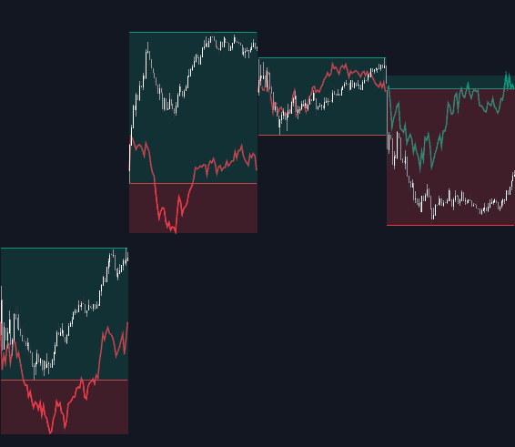
Each trading session is highlighted with an area that reflects the asset’s price movement for that session. When the asset outperforms the benchmark, the session background appears green. When it underperforms, it appears red. This creates a simple, visually driven way to monitor relative performance without needing to calculate returns manually.

The benchmark itself is plotted as a green or red line depending on whether its performance is above or below the asset. The indicator also includes an optional extended price area when the benchmark outpaces the asset. SPX is the default benchmark, but traders can easily switch to any symbol.

indicator image

Comparing performance against a benchmark is a core component of many trading strategies. Traders often use major indexes like the S&P 500 (SPX) or NASDAQ 100 (NDX) to evaluate whether their assets or portfolios are outperforming or lagging behind the broader market. This trading indicator simplifies that process by marking each session and summarizing performance clearly.

As shown in the chart, traders can quickly see how an asset such as QQQ performed relative to BTCUSD or GOLD session by session. For example, over the previous 15 sessions, the NASDAQ 100 outperformed BTCUSD in eight sessions and GOLD in six, while underperforming in the remaining sessions. This type of clear session-based comparison helps traders understand relative strength dynamics more effectively.

Display Mode (Rescaling Options)

indicator image

The Display Mode settings determine how the benchmark is transformed before comparison. This is crucial for traders who want a more statistically meaningful interpretation of relative performance. The three benchmark display modes are:

  • Net Returns – This uses raw benchmark returns from the start of the session, offering a simple and direct comparison.
  • Rescaled Returns – Adjusts benchmark returns based on the ratio of its volatility to the asset’s volatility, creating a more balanced and fair comparison.
  • Standardized Returns – Converts benchmark returns into a z-score and then rescales them using the asset’s volatility. This is the most advanced method and helps traders compare assets that behave differently.

Different display modes can highlight unique dynamics depending on market conditions. Standardized or rescaled returns are particularly helpful when comparing assets with differing volatility profiles.

Dashboard (Performance Analytics)

indicator image

The indicator’s performance dashboard provides session-level statistics and streak analytics that enhance decision-making for systematic and discretionary traders.

The dashboard includes:

  • Total number of overperforming and underperforming sessions
  • Streak analysis, where a streak is defined as two or more consecutive sessions of outperformance or underperformance
  • Winning and losing streak counts
  • Median and mode streak durations
  • Percentage of streaks lasting 3, 4, 5, and 6+ sessions

These insights help traders understand market behavior patterns such as momentum phases, mean-reversion tendencies, or shifts in relative strength. This is valuable for both trend-following trading strategies and contrarian approaches.

SETTINGS

  • Benchmark: Choose the benchmark ticker for comparison.
  • Display Mode: Select how the benchmark is transformed.
    • Net Returns
    • Rescaled Returns
    • Standardized Returns

Dashboard

  • Dashboard: Toggle the dashboard on or off.
  • Position: Choose where the dashboard appears on the chart.
  • Size: Adjust the size for readability.

Style

  • Overperforming: Show or hide overperforming session areas and choose the color.
  • Underperforming: Show or hide underperforming areas and choose the color.
  • Benchmark: Customize the benchmark line visibility and colors.

FAQ

What is the Relative Performance Areas trading indicator used for?
It’s designed to help traders compare an asset’s performance against a benchmark session by session, making relative strength and weakness immediately visible.

Which display mode is best?
Net Returns is simplest, while Rescaled and Standardized Returns provide more statistically balanced comparisons. Choice depends on your trading strategy and preference.

Can I use this tool for any market?
Yes. You can compare stocks, crypto, forex, commodities, or any TradingView-supported asset with any benchmark you choose.

How do I access the Relative Performance Areas indicator?
You can get access on the LuxAlgo Library for charting platforms like TradingView, MetaTrader (MT4/MT5), and NinjaTrader for free.

Free indicator

Get free access to this indicator on the platforms below.

TradingView
NinjaTrader
MetaTrader 4/5

Unlock the entire LuxAlgo Library

Every indicator, every strategy, full charts, and complete access to Quant — our AI agent.