Seasonals: Plotting Seasonal Trends for Multiple Instruments
Seasonality is the tendency for an instrument's returns to differ by position in the calendar: month of the year, day of the week, hour of the session. Plotting it means laying years of history side by side, averaging what happened at each calendar slot, and reading the result together with two numbers the average alone hides: how consistently the slot moved the same way, and how much one outlier year is doing the talking. Done that way across several instruments, seasonal analysis becomes a set of base rates that tilt a decision rather than a forecast that makes it. Done carelessly, it is the fastest way to find impressive-looking patterns in noise, because any sufficiently large return matrix contains striking squares by chance.
Key points:
- Three displays: an N-year average path with the current year overlaid, a return matrix or heat map with years as rows and calendar slots as columns, and a consistency score counting how often a slot closed the same way.
- The average is not the story: a month averaging −0.65% over ten years can have a positive median and a 60% hit rate once a single crisis year is set aside.
- Calendars are instrument-specific: equity folklore, commodity harvests and inventories, and crypto's short history each need their own matrix, and published effects have tended to weaken after publication.
- Base rate, not trigger: seasonal tilt sits on top of price analysis, position sizing and a regime read.
The LuxAlgo Library's Seasonality Chart, Seasonality Widget and Market Performance by Yearly Seasons build these displays for any symbol on Vela, our state-of-the-art charts, in one click, and Quant, our coding agent, can turn a seasonal window into a strategy you can inspect in Code and test with Run.
Video: Building a Seasonal Analysis Indicator
TOS Indicators published this build-along in August 2021 for a different charting platform. The construction it walks through, bucketing history by calendar slot and averaging, is the same one described below and the same one the Library's seasonality tools implement.
How to Identify and Plot Seasonal Trends
The Library's seasonality tooling page sets out the machinery. Every display starts from the same step: convert prices to returns so that years at different price levels can be compared, then align each year's returns to a common calendar index.
Returns, Alignment and Sample Size
Use percentage or log returns rather than price levels; a stock that tripled over twenty years shows positive raw change in most months purely from drift, which is a trend fact rather than a seasonal one. Align the years either by calendar date or by trading-day number; the two differ around month ends and holidays, and February 29 and holiday gaps have to be dropped or filled consistently. Decide whether the sample uses regular hours or the full electronic session, because RTH and ETH statistics can differ materially on the same futures contract. Then be honest about the sample. Twenty years of data is twenty observations per month; ten years is ten. Common lookbacks run from five to thirty years, and the trade-off is real: more years smooth the picture but blend regimes, fewer years track the current regime but rest on a handful of cases.
Average Path, Matrix and Consistency
Three displays do most of the work. The average path takes each calendar slot's return, averages it across the N years and plots the result through the year; the cumulative version stacks those averages so the year's historically strong and weak phases appear as inflections, and the current year is overlaid for comparison of shape and turning points rather than level. The return matrix puts years down the rows and months, weeks or weekdays across the columns, usually colour-graded as a heat map, so a column can be read for both its average and its dispersion. The consistency score counts the percentage of years in which a slot closed positive; a reading near 50% means the slot carries no seasonal tilt however smooth the average path looks there.
The table shows why the three belong together. It is a hypothetical ten-year September column for one equity index.
| Year | September return | Sign |
|---|---|---|
| 1 | +1.2% | up |
| 2 | −0.8% | down |
| 3 | +2.1% | up |
| 4 | −0.5% | down |
| 5 | +0.9% | up |
| 6 | −12.4% | down (crisis year) |
| 7 | +1.5% | up |
| 8 | −0.3% | down |
| 9 | +0.7% | up |
| 10 | +1.1% | up |
| Summary | Mean −0.65%; median +0.80%; consistency 60% positive; mean excluding year 6: +0.66% | |
Read on the mean alone, this is a bearish month. Read with the median and the consistency score, it is a mildly positive month with one catastrophic outlier, and the honest conclusion is that September carries little seasonal information for this index either way. The Seasonality Widget's Median statistic and its year filter exist for exactly this case, and the Market Performance by Yearly Seasons display of raw returns by season and year does the same job at season resolution.
Detrending: Separating Drift from Season
Detrending means removing the instrument's long-run drift so that the calendar component stands on its own. Using returns rather than prices does most of it; the remaining drift, the tendency for an equity index to rise in most months regardless of season, can be shown as a least-squares line through the seasonal results, which is what the Seasonality Chart's Linear Regression option draws. Slots above the line are seasonally strong relative to the instrument's own drift; slots below it are weak even if their raw average is positive. The Detrended Price Oscillator is a different tool for a different job: it subtracts a displaced moving average from price to expose cycles measured in bars rather than calendar dates, and because the average is shifted back it describes completed data rather than the current bar. It belongs to cycle analysis, not to seasonality, and the two should not be conflated.
Seasonality Across Instruments
Equities and the Calendar Folklore
Most named calendar effects come from US equity data and the Stock Trader's Almanac. The Library's pages give each one an honest status. The January effect, unusually strong January returns in small caps attributed to the reversal of tax-loss selling, has weakened substantially since it was publicised, which is what theory predicts for an anomaly that is easy to front-run; the January barometer, the separate claim that January's direction sets the year, is heavily flattered by the market's general upward drift. The Santa Claus rally has a precise definition, the last five trading days of December plus the first two of January, and Almanac data has the S&P 500 averaging roughly 1.3% over that window since 1950, positive in most years, with year-to-year spread that dwarfs the average. Sell in May is the finding that November-to-April returns have averaged higher than May-to-October, documented by Bouman and Jacobsen in 2002 across 36 of 37 country markets; the honest version is lower, not negative, and out-of-sample evidence since is contested. The month-of-year page puts September's historically weak average in the same category: visible in long samples, wide dispersion around it.
Currencies
Currency seasonality is weaker and less stable than the equity folklore suggests, and most of what looks seasonal in a currency pair is scheduled: central bank meetings, fiscal year-ends, quarter-end rebalancing and recurring data releases. The tooling page's warning applies with force here: recurring macro event days that fall inside a calendar bucket can masquerade as seasonality, so a currency matrix should be cross-referenced against the event calendar before any bucket is trusted. Where a tilt does appear, for example around a country's fiscal year-end, the consistency score and a split sample between the first and second half of the history are the checks that separate a persistent tendency from a few memorable years.
Commodities
Commodities have the clearest physical drivers: planting and harvest schedules for grains, heating and cooling demand for energy, inventory cycles for metals. Physical drivers make a seasonal tilt more plausible in advance, which is a genuine advantage over a pattern found by searching a matrix. They do not make it reliable in any given year; weather, storage levels and policy can overwhelm a typical path, and the futures curve already prices the expected seasonal move, so the spot pattern and the tradable return are not the same thing. The right procedure is unchanged: build the matrix for the specific contract, read the average with its consistency and dispersion, and treat the output as a base rate.
Comparing Instruments
Multi-instrument seasonal work has two parts. The first is building each instrument's own matrix; a commodity's calendar and an index's calendar are different objects and should never be averaged together. The second is checking how the instruments move relative to one another during the windows you care about, because two positions that look like separate seasonal ideas may be one exposure if their returns are highly correlated. The Library's correlation page is the reference; the native Historical Correlation indicator tracks the coefficient for up to ten ticker pairs from an anchor point you choose, plotted over time or as a heat-map snapshot, and can restart at each new month or quarter so that a seasonal window is judged on its own relationships. Our guide on why portfolio correlation is not enough covers the limits of that statistic in stress periods.
Seasonality on Vela
Three Native Seasonality Tools
The Seasonality Chart is the continuous view: it averages the price change recorded on each calendar day across a chosen Lookback (Years) into seasonal indexes and plots the result from January through December. Cumulative Sum stacks the indexes to show the year's phases as inflections, Use Percent Change switches from points to relative terms, and Linear Regression fits the drift line described above. It is designed for the daily timeframe, where history runs deep enough for the averages to mean something.
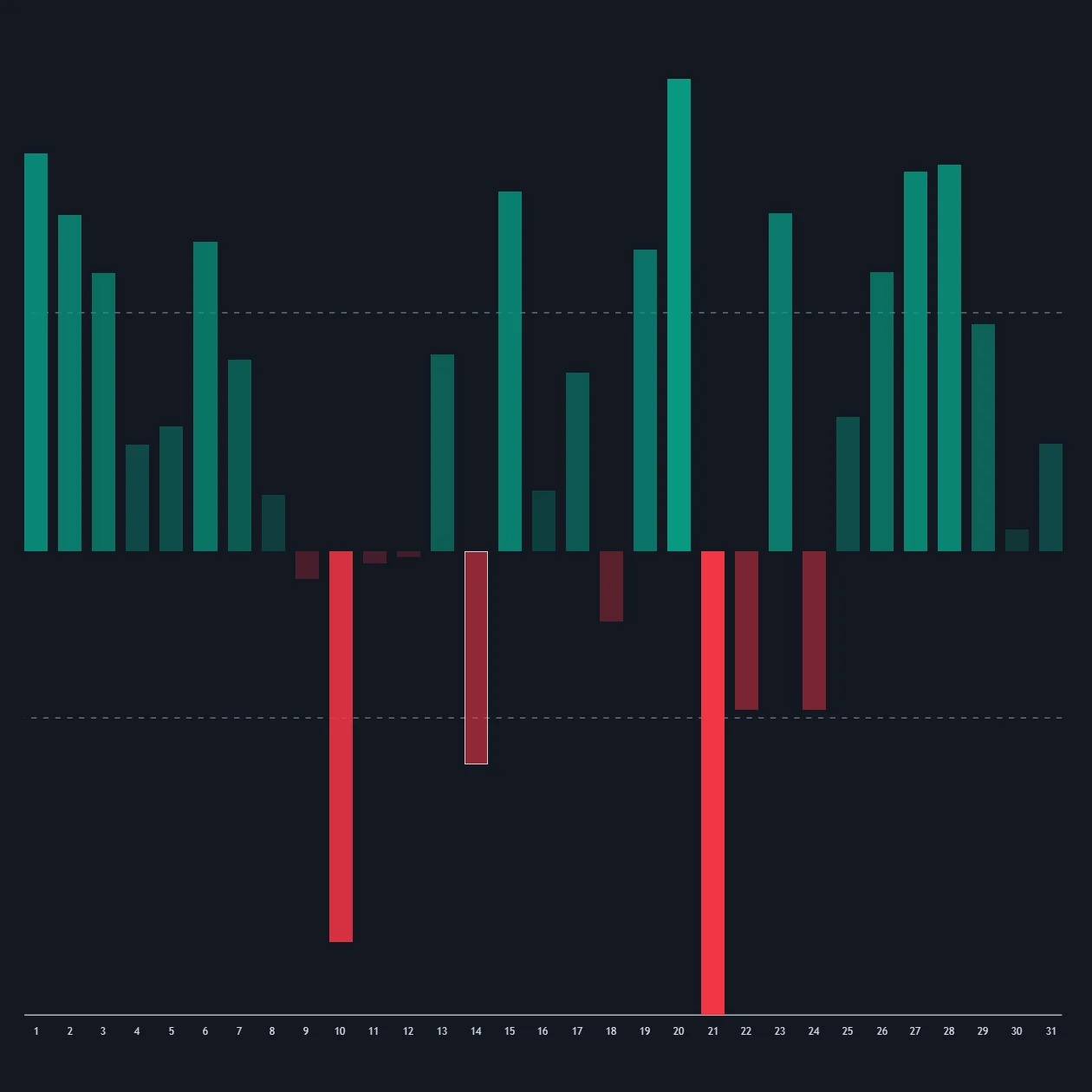
The Seasonality Widget is the bucket view. Granularity groups every observation since a chosen From Date by Hour, Day Of Week, Day Of Month, Month or Day Of Year; Analyze selects the series, from price change in absolute, percent or sign form to range, volume, and price or volume relative to a moving average; Statistic summarises each bucket as Mean, Median, Max, Min or Max-Min Average; and a filter drops specific values such as a crisis year from every bucket. Sign mode is normalised to 0 to 100, so a reading above 50 means positive changes outnumbered negative ones, which is a consistency score by another name.
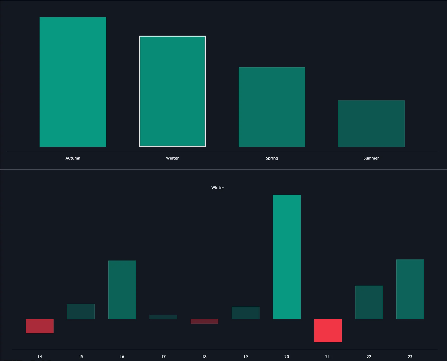
Market Performance by Yearly Seasons works at season resolution: bar charts of average returns for each of the four seasons over a ten-year period, the current season highlighted, with a raw-returns display by season and year, hemisphere selection, and a choice between meteorological seasons in whole months and astronomical seasons starting at the solstices and equinoxes. All three open on Vela from their Library pages, and their source is published, so the alignment and averaging choices can be read rather than assumed.
| Tool | What it shows | Best for | Where it runs |
|---|---|---|---|
| Seasonality Chart | One averaged path for the year, cumulative and regression overlays | Reading the shape of the typical year on daily data | Vela, from the Library page |
| Seasonality Widget | Bucket statistics by hour, weekday, day of month, month or day of year | Intraday and weekday tilts, median-based reads, year filtering | Vela, from the Library page |
| Market Performance by Yearly Seasons | Average and raw returns by season over ten years | Season-level orientation and consistency checks | Vela, from the Library page |
| Historical Correlation | Correlation for up to ten pairs from an anchor, lines or heat map | Checking that several seasonal ideas are not one exposure | Vela, from the Library page |
Testing a Seasonal Window with Quant
A seasonal tilt becomes testable once it is written as a rule: the instrument and data session, the calendar window, the entry condition (for example, the current year tracking the average path at the window's start), the stop, the target and the position sizing. Describe it to Quant, inspect the Code to confirm the window is defined by calendar date or trading day exactly as you intended and that entries evaluate on closed bars, and click Run. The Making Strategies with Quant guide shows the workflow, and the native backtest guide explains the Backtest Summary: net profit, trade count, win rate, maximum drawdown and profit factor, with commission and slippage set in the strategy properties. A seasonal rule fires once a year per instrument, so the trade count is small by construction; read it before the return, and hold out the most recent years the matrix never saw.
A trend or structure tool from the Library inside a seasonal window is confluence to test rather than confirmation, and the LuxAlgo platform does not place orders for you.
Using Seasonality Without Fooling Yourself
A Worked Seasonal Window Trade
Consider a hypothetical sector ETF whose ten-year average path rises about 6% through a two-month window with a 70% consistency score, a $25,000 account and a 1% risk budget of $250. The rule is a long at the window's first close if the current year is tracking the average path, a stop below the lowest close of the window's first week and a target at the average path's projected gain. See Risking It Right for the budgeting logic.
| Step | Calculation | Result before costs |
|---|---|---|
| Entry | First close of the window, current year tracking the path | Buy $48.20 |
| Stop | Below the first week's lowest close | Stop $46.40; $1.80 risk per share |
| Position size | $250 ÷ $1.80, rounded down | 138 shares; $248.40 planned risk; $6,652 notional |
| Target | $48.20 × 1.06 | $51.09; $2.89 reward, about 1.6R |
| Gap through the stop, fill at $45.60 | 138 × ($48.20 − $45.60) | $358.80 loss, about 1.4R; a stop level is not a guaranteed fill |
| Base rate | 7 of 10 years positive over the window | Three losing years in ten is the expected experience, not a failure of the rule |
The seasonal path supplied the direction and the target; price structure supplied the stop; the stop distance supplied the size. Whether a 1.6R target at a 70% historical hit rate survives costs and the years the matrix never saw is what the test reports, and at one trade a year per instrument the test needs several instruments and a long history before its answer means much.
Validation Checklist
| Check | Why | How |
|---|---|---|
| Consistency and dispersion | A strong average with mixed signs is usually an outlier artifact | Read the hit rate and the raw returns behind every bucket; switch to the median |
| Split sample | Published effects have weakened after publication | Compare the first and second halves of the history, or folklore era versus the last decade |
| Event overlap | Scheduled releases inside a bucket masquerade as seasonality | Cross-reference macro event days and earnings dates |
| Session convention | RTH and ETH samples differ on the same symbol | Fix the session before building the matrix and state it with the result |
| Instrument specificity | Commodity, equity and crypto calendars are different objects | One matrix per instrument; never average across asset classes |
| Multiple comparisons | A large matrix contains impressive squares by chance | Prefer tilts with a plausible driver; hold out recent years; test on other instruments |
Common Mistakes
- Trading the calendar alone. A seasonal window says when to look, not that price will comply; entries still need structure and a stop.
- Reading the mean without the median. One crisis year can flip a month's sign.
- Trusting small samples. Six years is six observations, however smooth the path looks; crypto histories barely support monthly columns.
- Ignoring what has already been priced. Futures curves embed expected seasonal moves; the spot pattern and the tradable return differ.
- Stacking correlated seasonal ideas. Three seasonal longs that move together are one position three times.
- Assuming persistence. Re-run the matrix each year and retire tilts whose recent-decade consistency has decayed toward 50%.
Conclusion
Seasonality is a legitimate statistical study with a long record of over-interpretation. The construction is simple: returns aligned by calendar slot, averaged across years, read with a consistency score and a view of the raw dispersion. The discipline is in what you do with it. Treat each instrument's matrix as its own base rate, cross-check it against scheduled events and against the other instruments you hold, size the trade from the stop rather than from the conviction, and expect the calendar to be wrong three or four years in ten even when the tilt is real. The Library's native tools put the displays a click away on Vela; the judgment about what they mean stays with you. For a companion read on timing, see Market Seasonality: Timing Your Trades.
Key Takeaways
- Three displays, read together. Average path, return matrix and consistency score; the average alone misleads.
- Base rate, not forecast. Seasonal tilt sits on top of structure, sizing and a regime read.
- One matrix per instrument. Equity folklore, commodity cycles and currency calendars are different studies, and correlation decides whether they are different trades.
- Weakening is the norm. The January effect, the barometer and sell-in-May all read weaker after publication; split the sample before trusting any of them.
- Native and testable. Seasonality Chart, Seasonality Widget, Market Performance by Yearly Seasons and Historical Correlation open on Vela, and Quant can build and test a seasonal window rule.
FAQs
How is a seasonality chart constructed?
Prices are converted to returns, each year is aligned to a common calendar index by date or trading-day number, and the return at each slot is averaged across the sample of years to form an average path; a cumulative version stacks those averages, and a return matrix lays years against months or weekdays as a heat map. A consistency score records the share of years in which each slot closed positive.
How many years of data do I need for seasonal analysis?
Common lookbacks run from five to thirty years. More years smooth the picture but blend market regimes; fewer track the current regime but rest on very few observations, since twenty years of monthly data is only twenty observations per month. Always read the consistency score and the raw returns behind a bucket, and treat anything built on a handful of years as a hypothesis.
Are the January effect and the Santa Claus rally still reliable?
The Library's pages give both an honest status. The small-cap January premium has weakened substantially since it was publicised, and the January barometer is flattered by the market's general upward drift. The Santa Claus rally, the last five trading days of December plus the first two of January, has averaged roughly 1.3% for the S&P 500 since 1950 and is positive in most years, with year-to-year variation far larger than the average.
What is the difference between the Seasonality Chart and the Seasonality Widget?
The Seasonality Chart is the continuous view: one averaged path for the whole year on daily data, with cumulative and linear-regression overlays. The Seasonality Widget is the bucket view: it groups history by hour, weekday, day of month, month or day of year and reports a chosen statistic per bucket, with a filter to drop specific years. They are companions, and both open on Vela from the Library.
How do I analyse seasonality across several instruments?
Build a separate matrix for each instrument, because commodity, equity and currency calendars are different objects, and then check how the instruments move relative to one another during the windows you care about. The Historical Correlation indicator tracks up to ten pairs from an anchor you choose, so several seasonal ideas can be checked for being one exposure in disguise.
Can I backtest a seasonal strategy on Vela?
Yes. Describe the instrument, session, calendar window, entry condition, stop, target and position sizing to Quant, inspect the Code to confirm the window is defined as you intended and entries evaluate on closed bars, and click Run. Set commission and slippage in the properties, read the trade count before the return, and hold out recent years the seasonal matrix did not use.
References
LuxAlgo Resources
- Vela
- LuxAlgo Quant
- Seasonality Chart Indicator
- Seasonality Widget Indicator
- Market Performance by Yearly Seasons Indicator
- Historical Correlation Indicator
- Seasonality Tooling
- Month-of-Year Seasonality
- Day-of-Week Effects
- January Effect
- Santa Claus Rally
- Sell in May
- Tax-Loss Selling Season
- Detrended Price Oscillator
- Correlation
- Macro Event Days
- RTH vs ETH
- Making Strategies with Quant
- Native Backtest Guide
- Market Seasonality: Timing Your Trades
- Portfolio Correlation Is Not Enough
- Risking It Right
External Resources
Read next