Concept
Chart Scales
Chart Scales, also known as log vs linear, percent, are Meta & Composition concepts. The Library holds 1 implementation, a working definition you can pull into Quant.
Top Chart Scales indicator
The top custom implementation, built on the original standard Chart Scales formula.
1 total
The Chart Scales implementation below can become a backtested trading strategy — describe your rules and Quant writes the code.
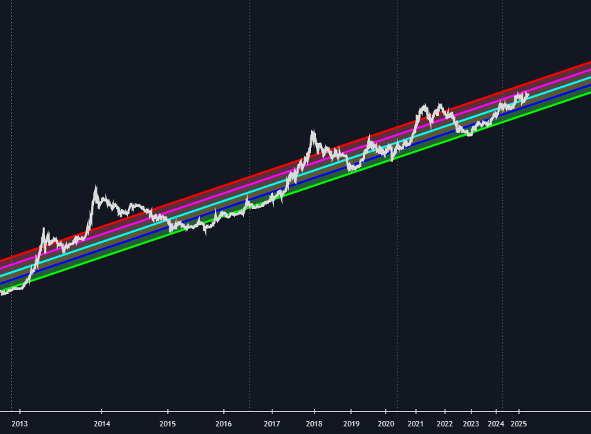
What are Chart Scales?
A chart scale is the rule that maps price to vertical distance on a chart. On a linear (arithmetic) scale, equal distances represent equal price increments: the move from 10 to 20 occupies the same height as the move from 90 to 100, even though the first doubles the asset and the second adds about 11%. On a logarithmic scale (strictly semi-log, since the time axis stays linear), equal distances represent equal ratios: 10 to 20 spans the same height as 50 to 100, and any constant percentage growth rate plots as a straight line. A percent scale rebases the axis to a reference point (often the first visible bar) and shows change from that anchor, so overlaid symbols become directly comparable.
The scale is not cosmetic; it changes the geometry of everything drawn in chart space. A straight trendline or parallel channel drawn on a linear chart becomes a curve in log space (horizontal levels excepted), and patterns that look clean on one scale can look broken on the other. The common convention is log for long histories, wide price ranges, and high-growth assets, so early data stays readable and every doubling gets equal weight; over short windows where price varies by a few percent, the two scales are nearly indistinguishable. Indicator values do not change with the scale, because they are computed from the price series, not from screen geometry.
How to read and choose a chart scale
Before trusting any drawn object, establish which scale the chart is on and whether it fits the data's range.
- 1Check the axis spacing: if the gridlines for 10, 20, 40, 80 are evenly spaced, the scale is logarithmic (equal ratios); if 10, 20, 30, 40 are evenly spaced, it is linear (equal increments).
- 2Match the scale to the range: for multi-year histories or assets that have moved by large multiples, log keeps percentage moves comparable across the whole chart; for short intraday windows, linear is standard and the difference is negligible.
- 3Re-validate geometry after switching: trendlines, channels, and pattern boundaries drawn on one scale do not carry over as straight lines on the other, so redraw and reassess before acting on them.
How traders use it
- As the workspace for long-horizon trend analysis: on a log scale, constant-percentage growth plots as a straight line, which is why multi-year trendlines and growth channels on high-growth assets are drawn in log space; power-law growth curves fit to assets like Bitcoin also work on log prices, though they plot straight only when the time axis is log-scaled as well.
- As a drawing convention: pick one scale per instrument and horizon and keep it, because a channel respected for years on a log chart generally does not exist as a straight line on the linear version of the same data.
- As a calculation choice for retracement tools: Fib retracement levels can be interpolated arithmetically or in log space, and on wide ranges the two produce visibly different levels, so the tool's setting should match the scale you analyze on.
- As a comparison device: percent scale rebases every overlaid symbol to a common anchor, turning the chart into a relative performance view rather than an absolute price view.
Chart Scales vs other chart transforms
Renko: Renko rebuilds the bars themselves from fixed-size price bricks and discards the uniform time axis; a chart scale changes only how the vertical axis spaces prices and leaves every bar's data untouched.
Heikin Ashi: Heikin Ashi keeps one candle per period but recomputes it from averaged values, so its opens and closes are synthetic prices rather than traded ones; switching scale never alters a single plotted value, only the spacing between them.
Ratio/spread Charts: A ratio chart divides one instrument by another to create a new relative-performance series; a percent scale merely rebases the display of each series, and the underlying data remains each instrument's own price.
Concept family
Meta & Composition
28 concepts mapped · 28 in the Library
Chart Scales FAQ
Turn Chart Scales into a trading strategy.
Take the implementation from this page into Quant, then build on it, backtest it on real data, and keep refining it in conversation.