Concept
Volatility Signature Plot
Volatility Signature Plot is a Volatility concept. The Library holds 1 implementation, a working definition you can pull into Quant.
Top Volatility Signature Plot indicator
The top custom implementation, built on the original standard Volatility Signature Plot formula.
1 total
Want to trade Volatility Signature Plot? The implementation below is one prompt away from a backtested strategy in Quant.
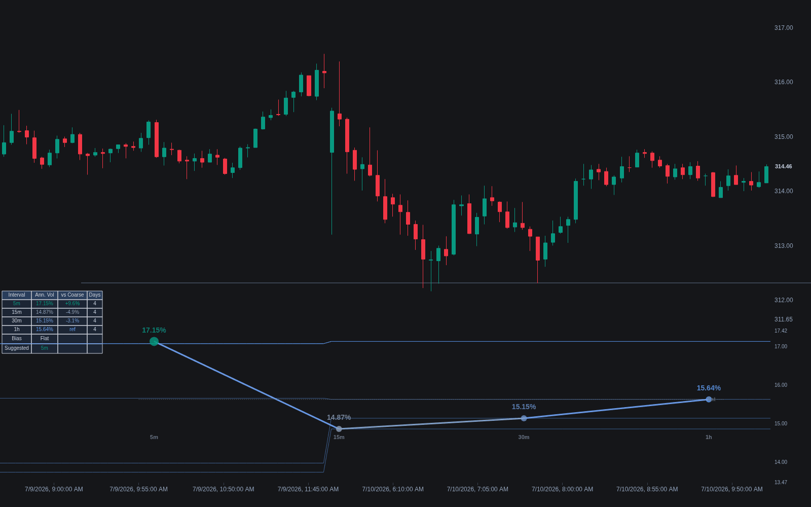
What is a volatility signature plot?
A volatility signature plot graphs realized volatility against the sampling frequency used to compute it. You measure realized variance from squared returns sampled every 1 minute, 5 minutes, 15 minutes, and so on, average each estimate over many days, and plot the result as a function of the sampling interval. In a frictionless market the line would be flat, since true variance does not depend on how often you look. Real markets bend the line at fine intervals, and the shape of that bend is the signature.
The tool comes from the realized-volatility literature in econometrics around 2000, associated with the work of Torben Andersen, Tim Bollerslev, Francis Diebold, and Paul Labys. Its purpose is diagnostic: microstructure frictions such as bid-ask bounce induce negative autocorrelation in very high-frequency returns, which inflates measured variance as sampling gets finer. Illiquid instruments with stale or sluggish quotes can show the opposite, a downward bias at fine intervals.
Practitioners care because realized volatility is only as good as its sampling choice. The signature plot makes the bias visible and points to the coarsest region where the line flattens, historically often in the vicinity of 5-minute sampling for liquid instruments, as a sensible operating point. It is the standard sanity check before feeding realized measures into forecasting models, execution analytics, or any of the volatility estimator comparisons that assume clean inputs.
How it's calculated
Realized variance computed at a grid of sampling intervals, averaged across days and plotted against the interval.
Averaging over many days (often 20 or more) is essential; a single day's plot is dominated by noise.
Prices can be sampled from trades, midquotes, or previous-tick interpolation, and the choice changes the fine-interval behavior.
Overnight gaps are usually excluded and handled separately, since they are not part of the intraday sampling question.
How traders use it
- Choosing a sampling frequency: the standard read is to pick the finest interval at which the plot has flattened, keeping as much data as possible without absorbing microstructure bias into the volatility estimate.
- Diagnosing data quality: an upward-sloping signature at fine intervals on trade data flags heavy bid-ask bounce, while a downward slope often betrays stale quotes or thin trading, useful before trusting any high-frequency analytics on that instrument.
- Comparing instruments and venues: signature plots for the same asset from different data feeds or exchanges reveal which source is cleaner at a given resolution.
- Its limitations: the flat region can be ambiguous or absent for illiquid names, the plot is an average that hides day-to-day variation, and it diagnoses bias without removing it; noise-robust estimators exist beyond the scope of the plot itself.
Signature plot vs related volatility views
Realized Volatility: Realized volatility is the quantity being estimated; the signature plot is a diagnostic of how that estimate changes with sampling choice. One is the measurement, the other the calibration chart for making it.
Volatility Term Structure: The term structure varies the forecast or maturity horizon while holding the measurement fixed. The signature plot varies the sampling interval of the measurement itself while the period measured stays the same. The axes look similar; the questions are unrelated.
Volatility Cones: Cones summarize the historical distribution of volatility across window lengths for valuation context. The signature plot is not about history or valuation at all; it is about measurement bias at fine time scales.
Concept family
Volatility
57 concepts mapped · 57 in the Library
Volatility Signature Plot FAQ
Turn Volatility Signature Plot into a trading strategy.
Take the implementation from this page into Quant, then build on it, backtest it on real data, and keep refining it in conversation.