Concept
Gann Fan & Angles
Gann Fan & Angles, also known as 1×1, 2×1, 4×1 angles, are Trend concepts. The Library holds 1 implementation, a working definition you can pull into Quant.
Top Gann Fan & Angles indicator
The top custom implementation, built on the original standard Gann Fan & Angles formula.
1 total
From studying Gann Fan & Angles to trading it: take the implementation below into Quant and backtest it instantly.
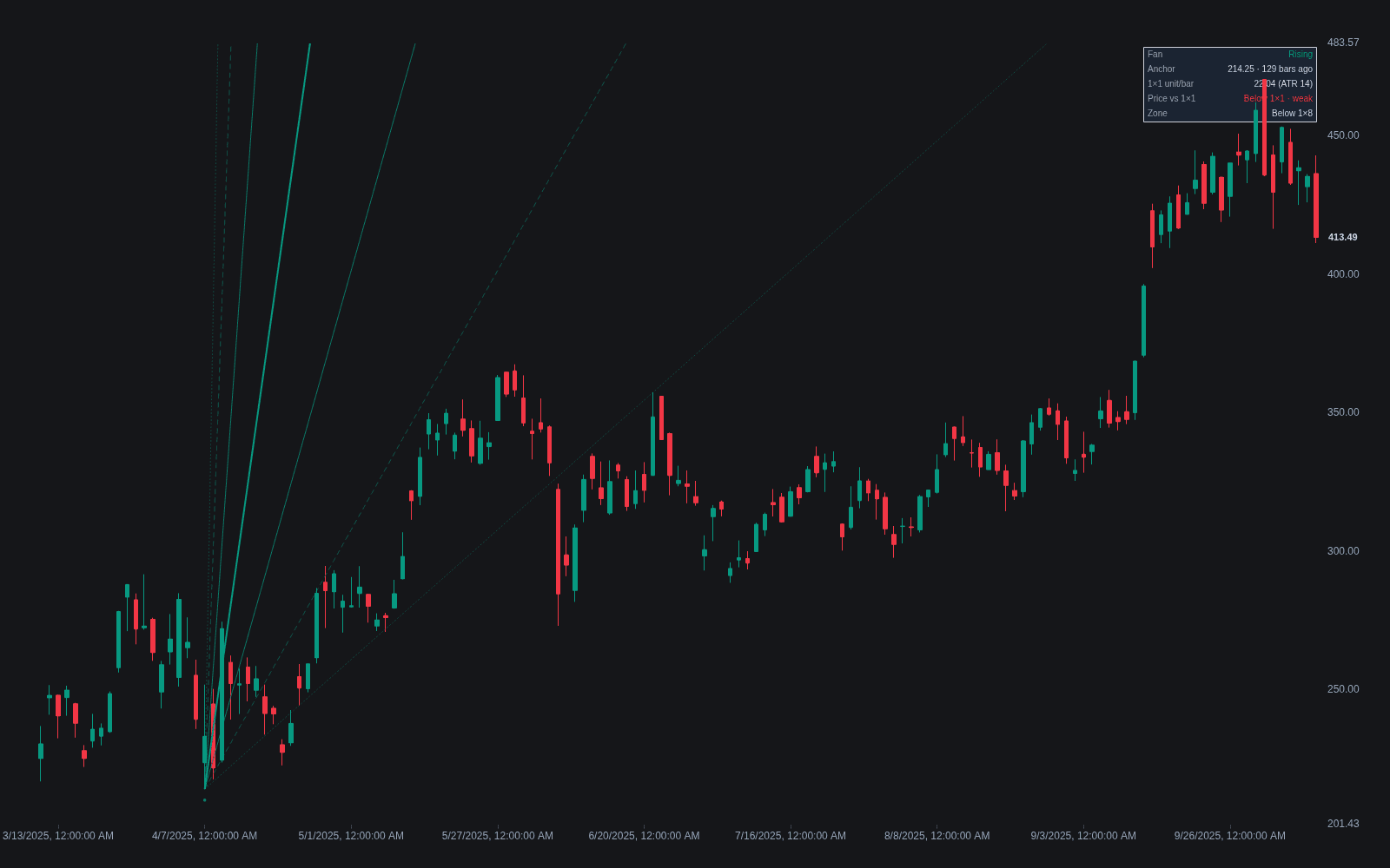
What are Gann Fans & Angles?
Gann angles are lines drawn from a significant pivot at fixed rates of price change per unit of time, and a Gann Fan projects the standard set of them from one anchor. The centerpiece is the 1×1 angle, one price unit per one time unit, which W.D. Gann treated as the balance line between price and time; steeper angles (2×1, 3×1, 4×1, 8×1) and shallower ones (1×2, 1×3, 1×4, 1×8) fan out on either side. Unlike a trendline fitted to actual swing points, Gann angles are pure geometry: the slopes are fixed in advance, and only the anchor is chosen.
The angles come from W.D. Gann (1878-1955), who taught from the 1920s through the 1950s that markets move in proportional relationships of price and time, the 45-degree line marking their balance. How faithfully modern fan tools reproduce what Gann actually did is debated, since his courses are cryptic and his charts were drawn on paper with explicit unit scales. What survives cleanly is the framework of fixed-rate lines radiating from a pivot.
The conventional reading is that a trend holding above the 1×1 is strong, a trend below it is weak, and when price breaks one angle it tends to travel toward the next, so each fan line acts as sloped support or resistance. Successive breaks toward the shallow side of the fan read as the trend losing speed and often precede a fuller reversal attempt; a broken angle is then watched for resistance from the other side.
The unavoidable caveat is scale: one unit of price per one unit of time means nothing until you define how many points equal one bar, so the same fan looks different under different chart scales and zoom levels. Usable implementations fix the price-per-bar ratio explicitly; some modern indicators derive the unit from volatility, scaling the 1×1 to the instrument's typical range per bar. Without a fixed convention, the angles are decorative; traders who want sloped references without a scaling decision often reach for an adaptive line such as an EMA instead.
How to draw a Gann Fan
A fan needs two decisions, the anchor and the price-per-bar scale; everything else is standard.
- 1Anchor at a significant pivot: a major swing low for a rising fan, a major swing high for a falling one.
- 2Fix the scaling that defines the 1×1, via the platform's points-per-bar setting or a volatility-derived unit; without this the angles are arbitrary.
- 3Apply the fan so the 1×1 rises (or falls) at the chosen rate, with the steeper and shallower angles fanning out around it.
- 4Sanity-check on history: a well-scaled fan shows past reactions spread across several angles rather than all price action hugging one extreme line.
- 5Track which angle currently contains price and watch behavior at each line: respect, break, retest from the far side.
How it's calculated
A set of rays from a single pivot whose slopes are fixed price-per-time ratios, with the 1×1 line advancing one price unit per bar.
The quoted angle degrees (45 for 1×1, out to 82.5 for the steepest and 7.5 for the shallowest ray) hold only at the chosen scale u; rescaling the chart changes every angle.
Labeling conventions conflict: some platforms write price×time (2×1 steeper than 1×1), others time×price (2×1 shallower), so check which set your tool uses.
Unlike an ordinary trendline, a Gann angle is fixed by the anchor and scale alone, not by a second pivot.
How traders use it
- As sloped support and resistance: watching for reactions where price meets a fan line, and for the line's role to flip once it breaks.
- As a trend-strength gauge: which angle currently contains price (riding above the 1×1 versus sagging into the shallow angles) summarizes how the move measures against Gann's balance line.
- As confluence with horizontal tools: a fan line intersecting a fixed level, such as a prior high or a daily floor pivot, gets more attention than either alone.
- As break-and-target structure: when one angle gives way, the adjacent angle becomes the working reference, a built-in sequence of sloped breakout levels and travel targets.
- As a slope benchmark: comparing a trend's realized climb rate to the 1×1 plays the same role as reading an average's gradient with an MA slope filter, except the benchmark is fixed geometry, not a smoothed line.
Gann Fan vs other sloped references
Trendline: A trendline's slope comes from the market: drawn through actual pivots, every trendline is unique to its chart. Gann angles impose predetermined slopes and let the market choose only the anchor. Trendlines describe what price did; Gann angles test price against a fixed geometric standard.
Supertrend: Supertrend builds a trailing line from average true range, so its distance adapts to measured volatility, and it flips sides mechanically. A Gann fan never adapts: its lines are straight, fixed at drawing time, meaningful only under the chosen scale. One is a volatility-aware trailing system; the other a static geometric framework.
Dynamic S/R Via MA: Moving-average support and resistance bends with price and requires no scaling decision, at the cost of lagging turns. Fan lines are straight and projected forward from the anchor, so they offer levels ahead of price, but depend entirely on anchor and scale choices that averages avoid.
Concept family
Trend
100 concepts mapped · 100 in the Library
Gann Fan & Angles FAQ
Turn Gann Fan & Angles into a trading strategy.
Take the implementation from this page into Quant, then build on it, backtest it on real data, and keep refining it in conversation.